Bertie CMS
Replaced Forbes' decade-old WordPress CMS as sole designer, building a publishing platform with integrated AI writing tools that now produces every story on Forbes.com.
- Platform
- Responsive Web App
- Team
- UX Designer (me)
- 1 Product Owner
- 2 Product Managers
- 2 Data Scientists
- 3-4 Lead Developers
- Status
- Launched
- Overview
After years of relying on a bloated and buggy WordPress CMS to publish content to Forbes.com, Bertie was born. Developed entirely from scratch by the Forbes Product & Tech team, Bertie was designed to be the ultimate replacement for the outdated platform. Integrated with AI story-writing tools, Bertie gives users the power to create captivating and impactful narratives.
- My Role
As the sole UX designer on the Product & Tech team, I was given the opportunity to design a new CMS completely from scratch. Throughout the project, I collaborated closely with project managers, engineers, data scientists, developers, and business stakeholders, beginning from wireframes and user flows, to giving Bertie a "voice" through branding and personality, as well as integrating AI features seamlessly into the experience.
Background
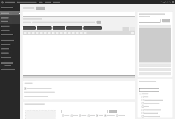
Forbes.com had been running on WordPress for at least a decade. Years of custom plug-ins and hacks had left it unstable and unreliable.
The UI itself was standard WordPress. Users were mostly familiar with it as regular users of the platform, but there was a lot of unnecessary clutter for someone who just wants to write an article.
The content was evolving too. More attention was going toward mobile experiences, special features, and list packages, and a new site redesign was rolling out. Customizing the existing platform to keep up would have been an even bigger undertaking, and adopting another out-of-the-box solution would have been costly and time-consuming. Starting from scratch let us build exactly the experience we wanted, without inheriting anyone else's overhead.
Objective
Having been with the company for almost a decade, I was familiar with the state of the current CMS. I wasn't a daily user, but I knew the features, having worked on some myself, and working in close proximity to daily users meant I heard their frustrations with the platform regularly.
Our objective was to empower and inspire writers to share compelling stories. We wanted an experience that let users focus on writing without the clutter, and given how much instability and bloat they had lived with, the new platform needed to feel secure and calm. Once logged in, all they should have to do is start typing.
- Mapping the Experience
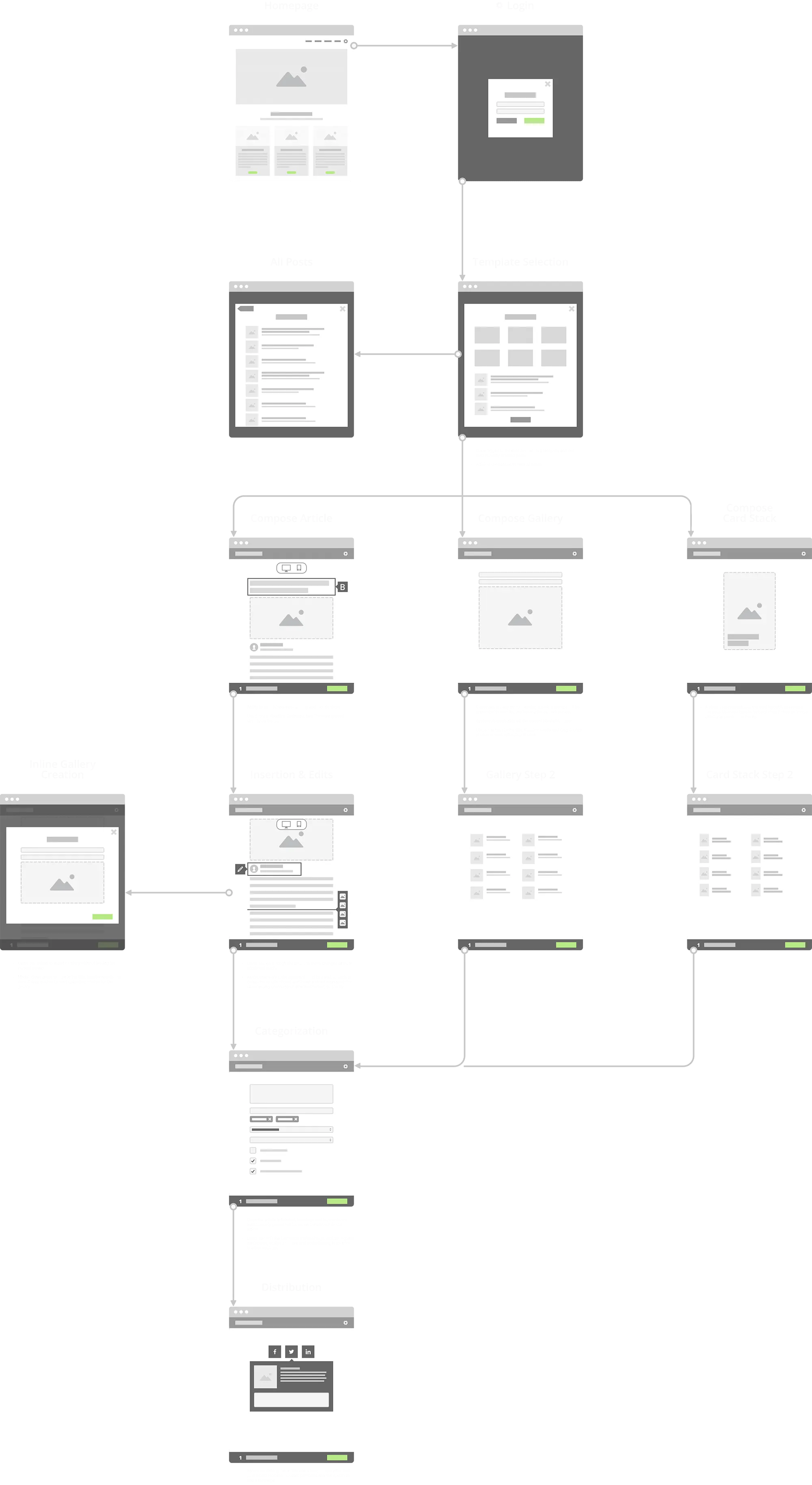
After initial research and stakeholder meetings, I mapped out the initial user flow to help everyone visualize what the experience could be. Since the new CMS would inherit most of the existing features and support multiple content types, I started there: a flow that lets users select a template when they log in, then traces each path through to publishing.
Early Prototyping
I created a simple prototype to demonstrate a few high-level interactions, including a toggle that switches between desktop and mobile previews and a sticky drawer that steps the user through publishing.Exploring Options
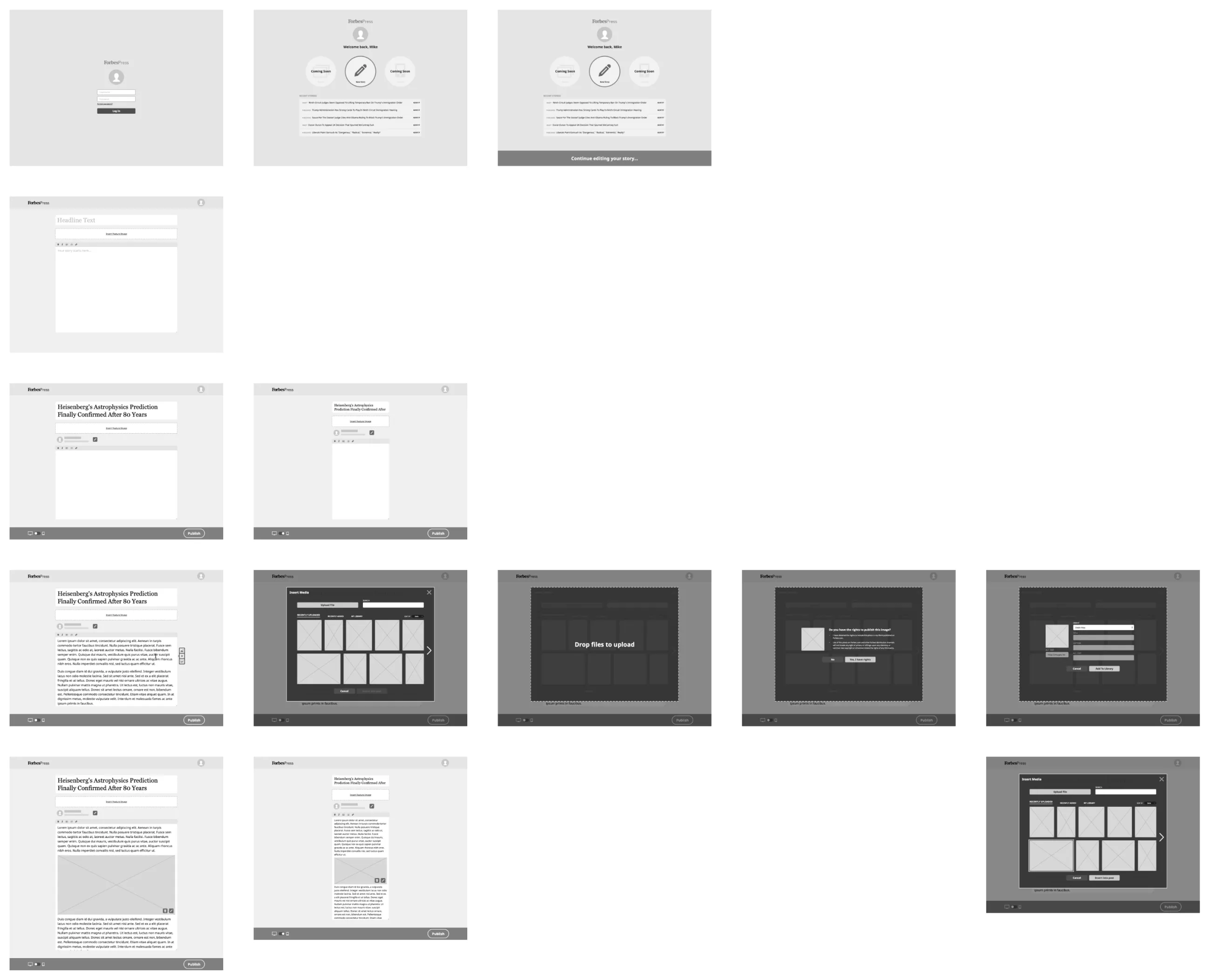
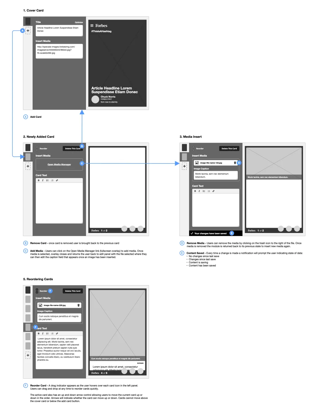
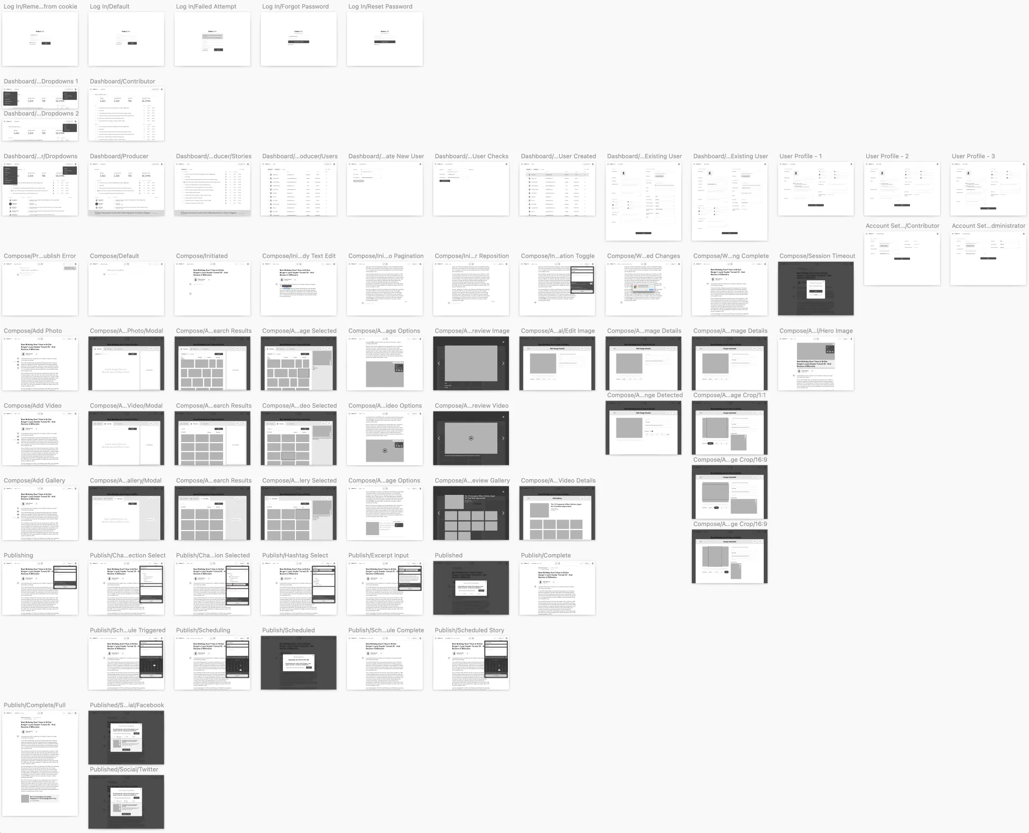
Moving to more detailed wireframes, I explored layout options, captured potential paths, and mapped out flows for MVP features. While waiting on the final product name, I used "ForbesPress" as a placeholder.
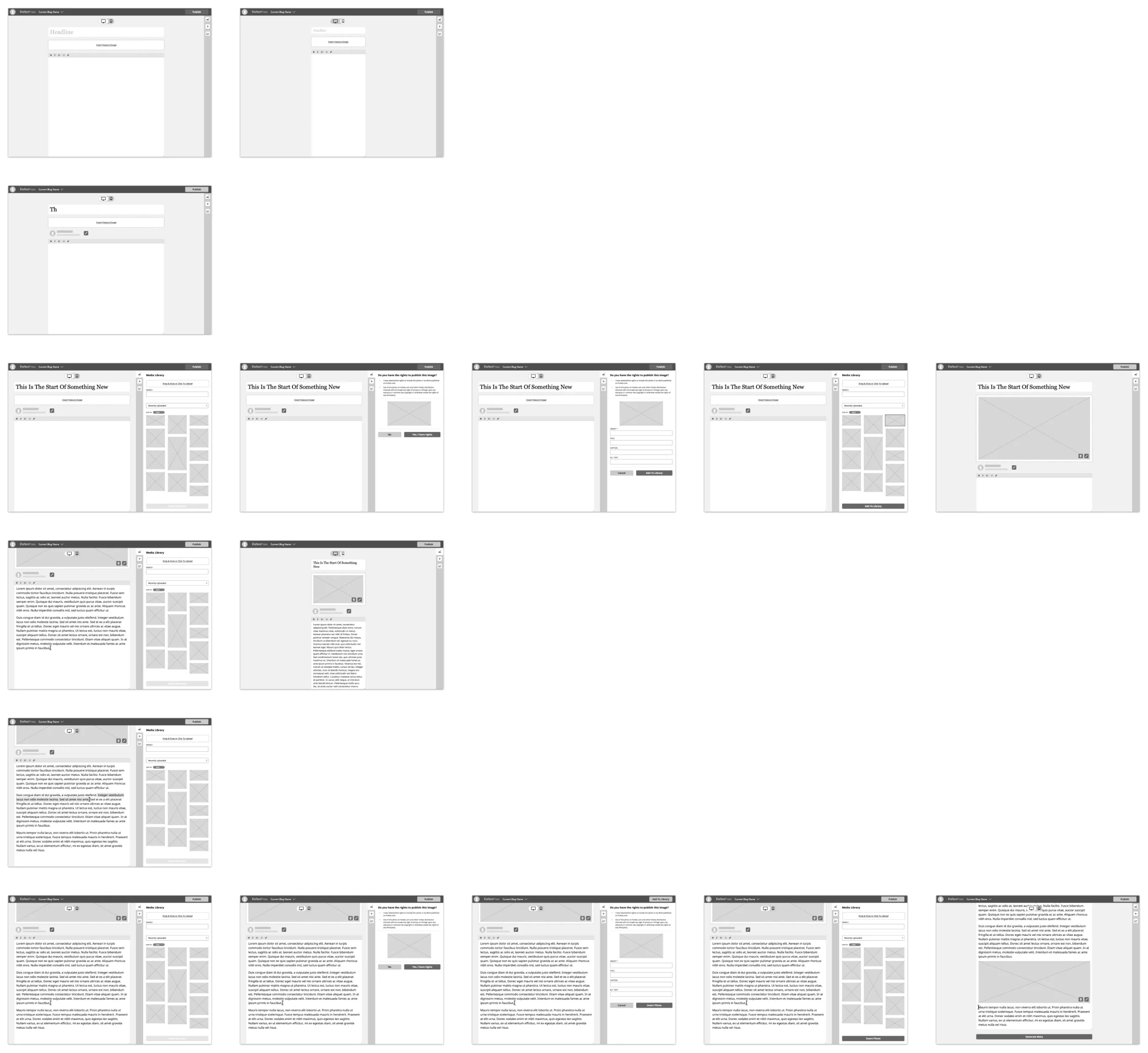
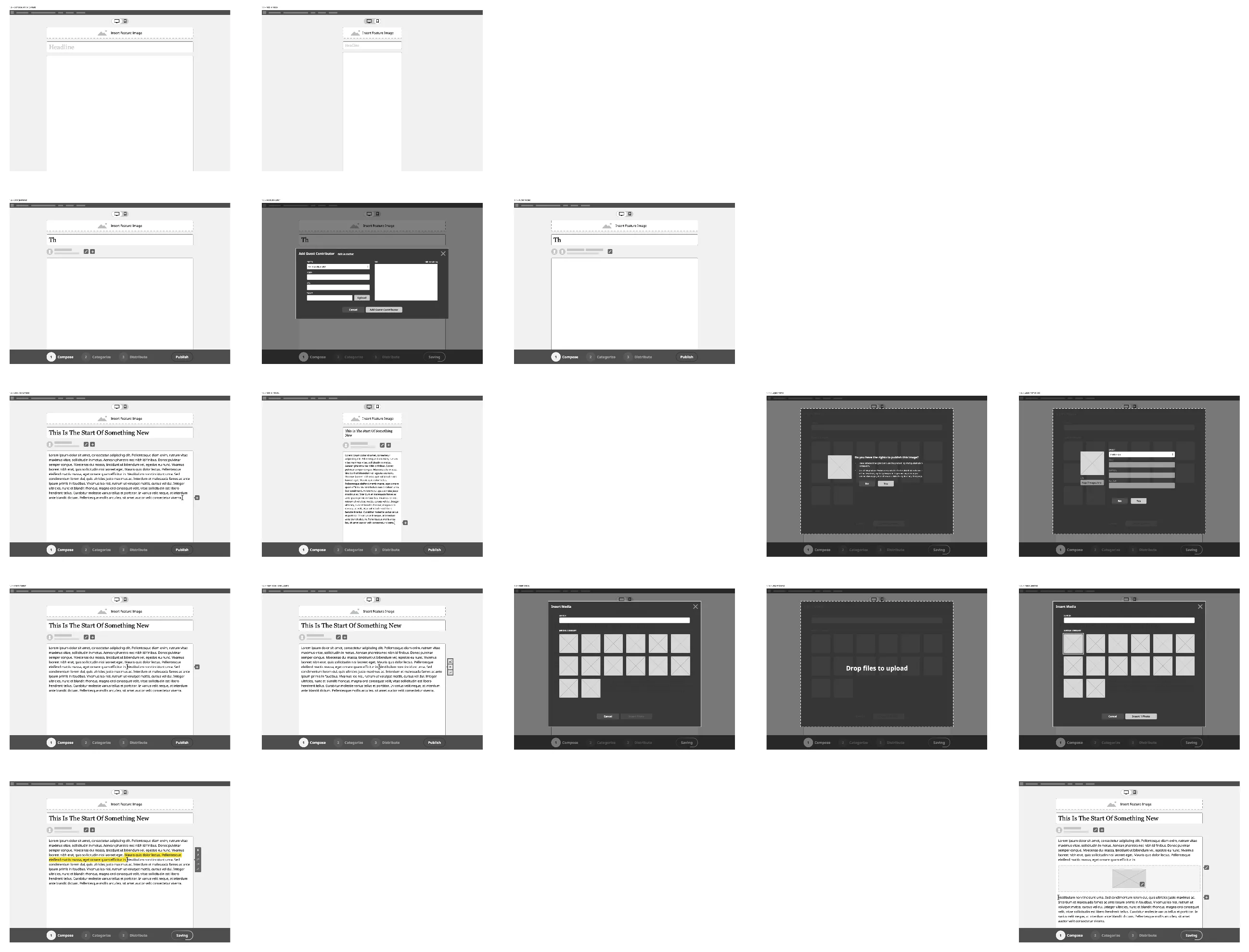
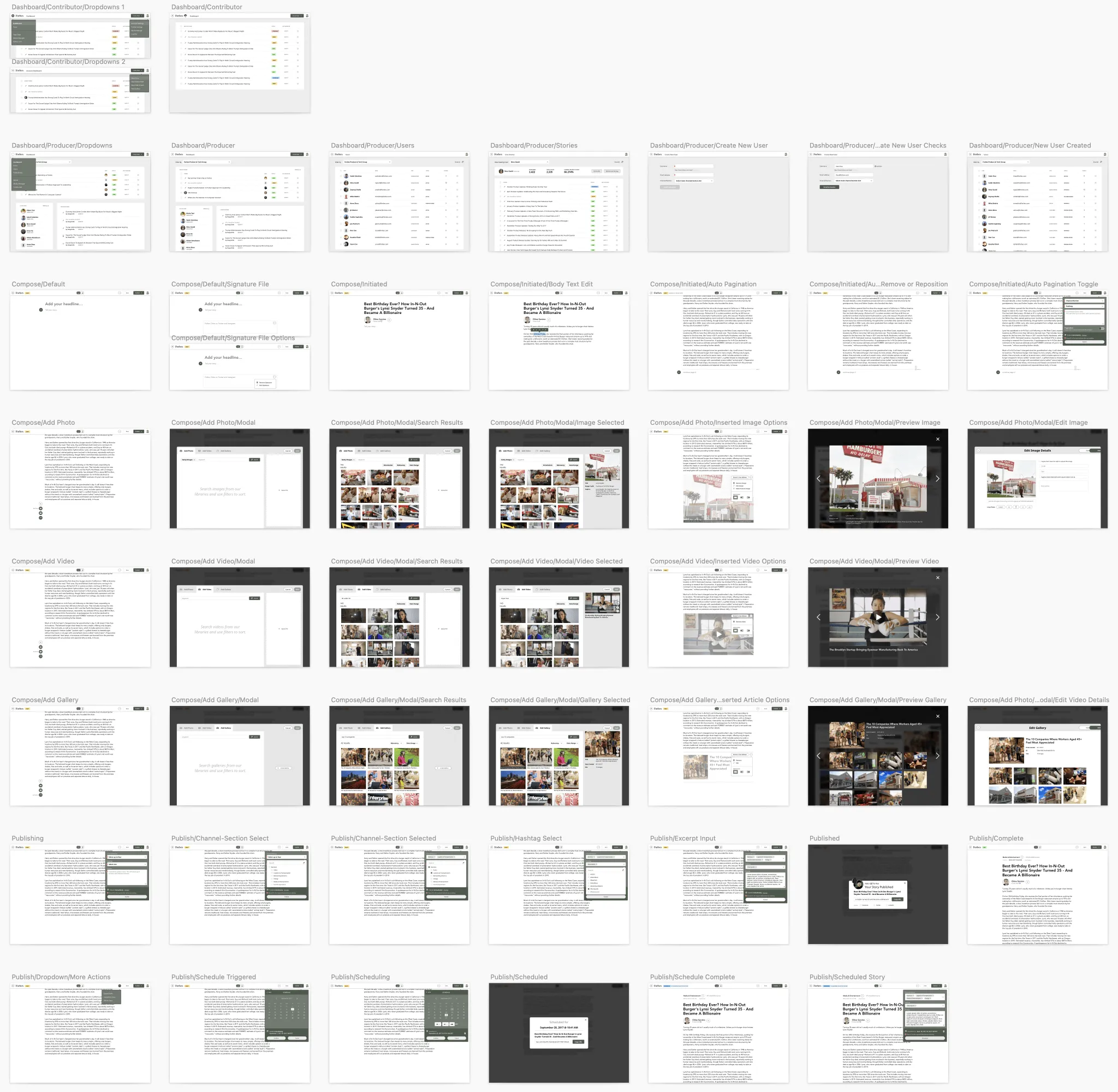
The Mobile PWA project had recently launched, so I also wireframed what it could look like to create, modify, and publish content in the PWA format.
Gathering Feedback
With several options taking shape, it was time to validate our assumptions. I reached out to producers, editors, and writers, and secured 10 participants for one-on-one comparative usability tests between two prototypes. I added hotspots to the wireframes and connected screens into task flows for the sessions.
I opened each interview by asking about their experience with the current CMS and what their daily workflow looked like, so I could understand their pain points before showing them anything. I then gave them the prototypes and a task list and asked them to think aloud as they worked through each one.
- Participants:
- 4 Producers/Senior Producer
- 3 Editors/Assistant Online Editor
- 3 Writers/Reporter
- Tasks:
- Log in
- Create new story
- Add a headline
- Add a feature image
- Add body text
- Upload an image of Adele in the body
- Publish
- What We Learned
The most telling finding wasn't about any specific screen. It was that the current CMS was unstable enough that most users didn't trust it with their drafts, writing in Google Docs or Word first and pasting in at the end. That confirmed the objective: before Bertie could be pleasant to use, it had to be somewhere people were willing to write.
The rest of the findings were more specific:
- Users would prefer role-specific dashboards.
- Image search needed work:
- filtering by orientation
- viewing and filtering by photo source
- more real estate for browsing
- Users wanted to see caption and credit after a photo is inserted.
- Users wanted to preview a post before and after publishing, and copy its URL.
- A majority expected and preferred the Publish button at the bottom.
- The expanding drawer was disorienting.
- Some icons were too ambiguous.
Iterate & Validate
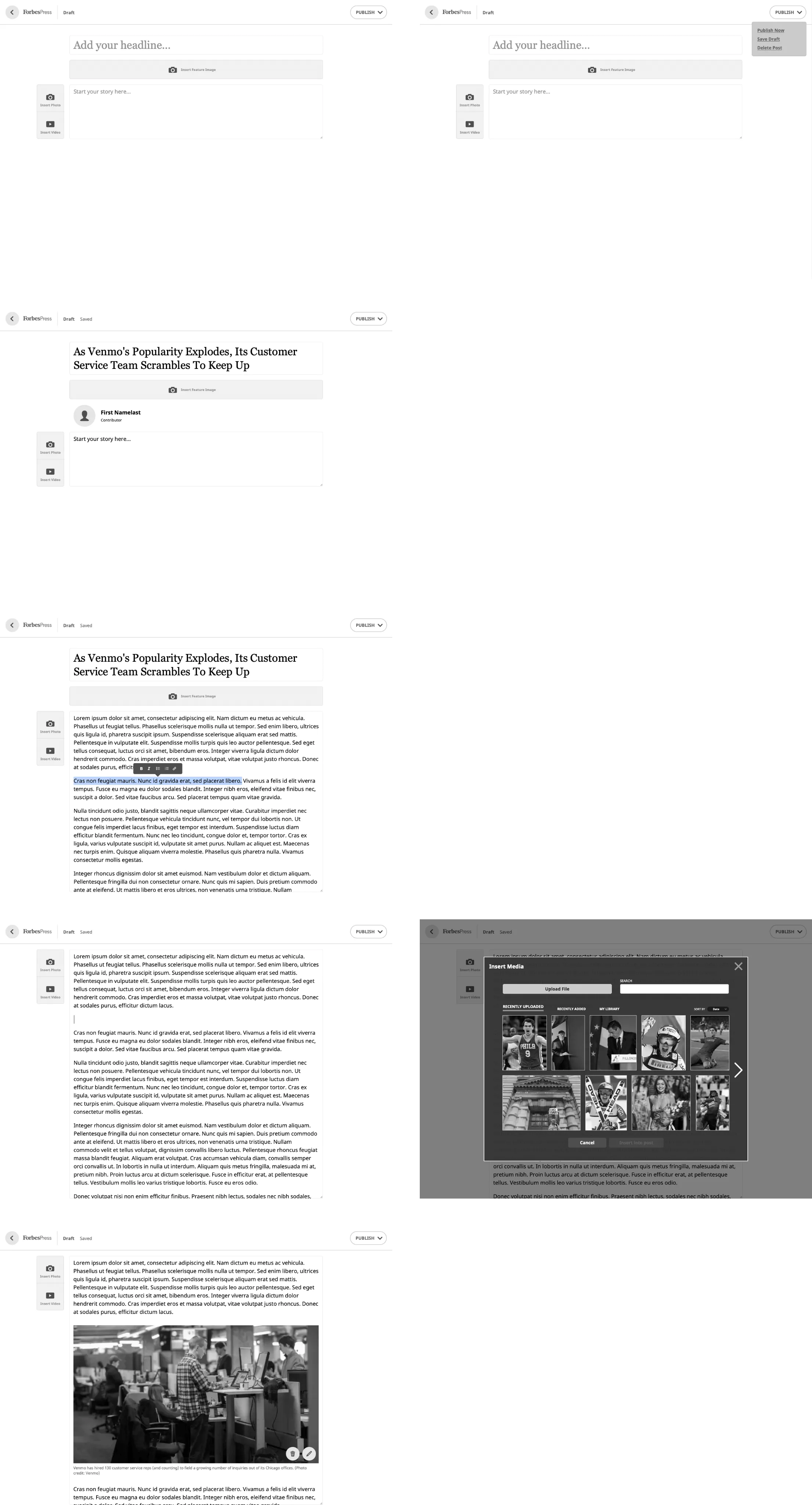
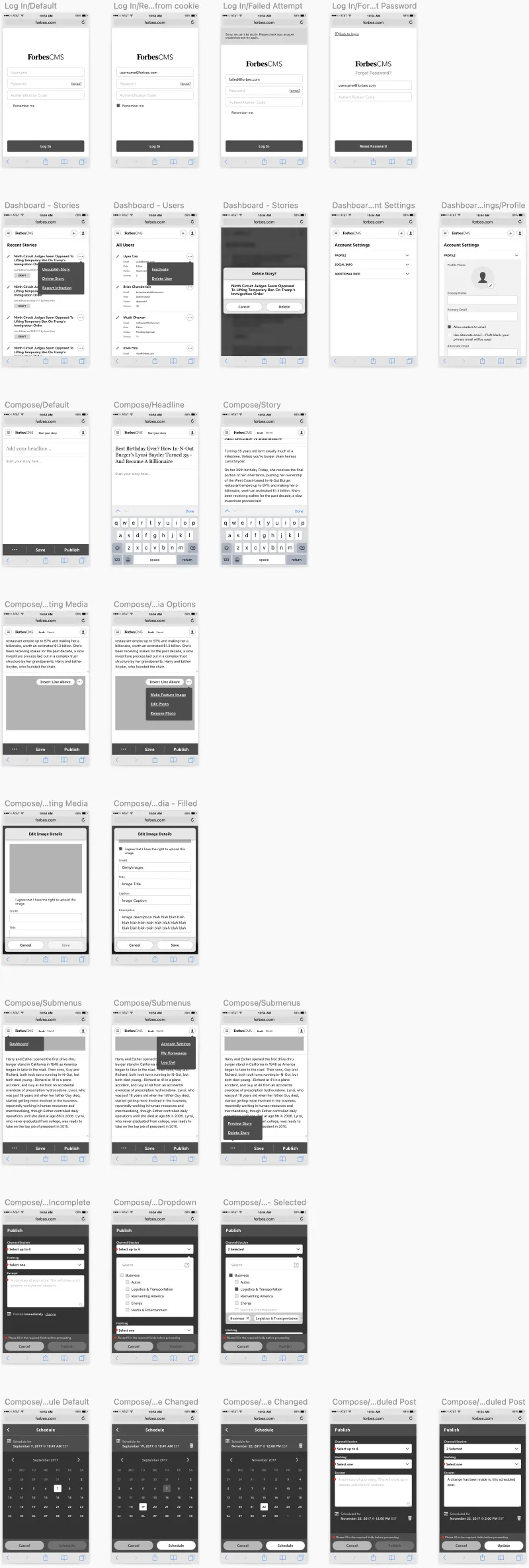
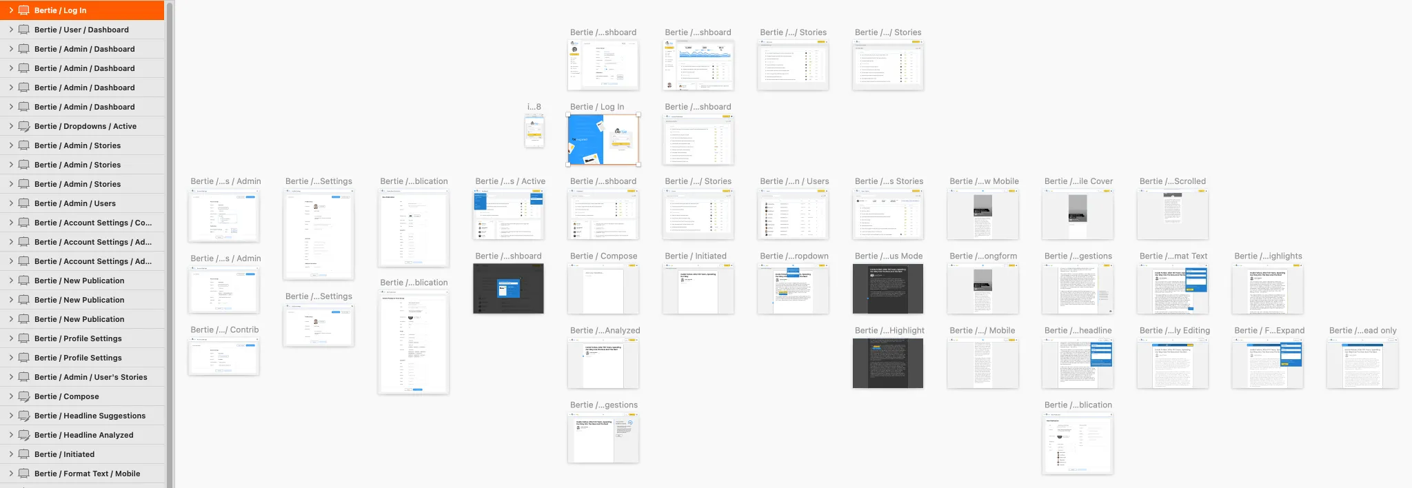
After synthesizing the interviews, I updated the designs and fleshed out the flows in much more detail, cleaning up the layout and sharpening the points of interaction.
The publish button now became a dropdown holding the three actions that decide a post's fate (Publish now, Save draft, and Delete post) so the controls that change publication state lived together rather than scattered across the page.
That placement went against the usability test, where a majority expected Publish at the bottom. Their expectation made sense in the prototype they saw, which had a toolbar running along the bottom of the screen. Once I removed that toolbar, the bottom placement lost its anchor, and a primary action sitting below a variable-length article is one users have to scroll to find. Moving it into the sticky header kept it reachable at any scroll position, and grouping the destructive action alongside it meant Delete was somewhere users would look for it rather than somewhere they'd hit it by accident.
The body became more of a WYSIWYG experience, removing input borders and matching the published article's font styling so drafting looked like the finished product. Headline and body placeholder text moved to more actionable language, bylines populated automatically from the user profile, and tools revealed themselves only when triggered.

Prototyping Interactions
As I iterated, I kept building prototypes to test scenarios that were easier to evaluate through interaction than through flat screens.
Hi-Fidelity! 👋🏻 Hi Bertie!
Once the wireframes were in good shape, I moved to high-fidelity mockups. Every minor detail was pixel perfected, images replaced placeholders, and icons and buttons were polished and added to a growing library of components. As I built each component I stress tested it against extreme cases and created empty and error states where applicable.
Knowing when to pivot
As the mockups progressed, the designs leaned very minimal and clean, so users could focus solely on writing. I kept the color choices muted so article media could stand out. But the direction started looking too minimal. It was bland and voiceless.
Once 'Bertie' was finalized as the product name, I could finally give it an identity: a logo, colors, and a design system of its own.
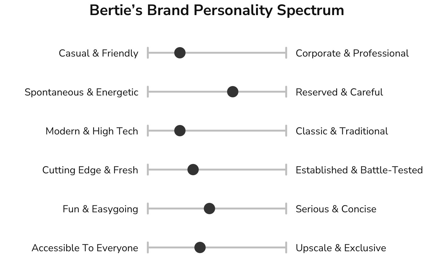
To brand Bertie appropriately, I met with stakeholders and placed Bertie on a brand personality spectrum, rating each dimension from 1 to 5 against a different emotional appeal and customer expectation.
Bertie who?
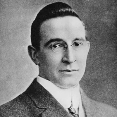
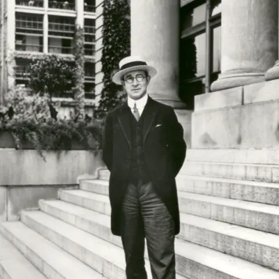
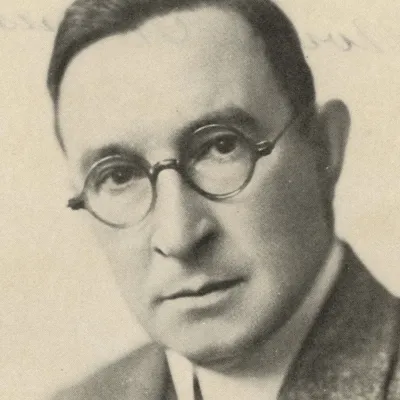
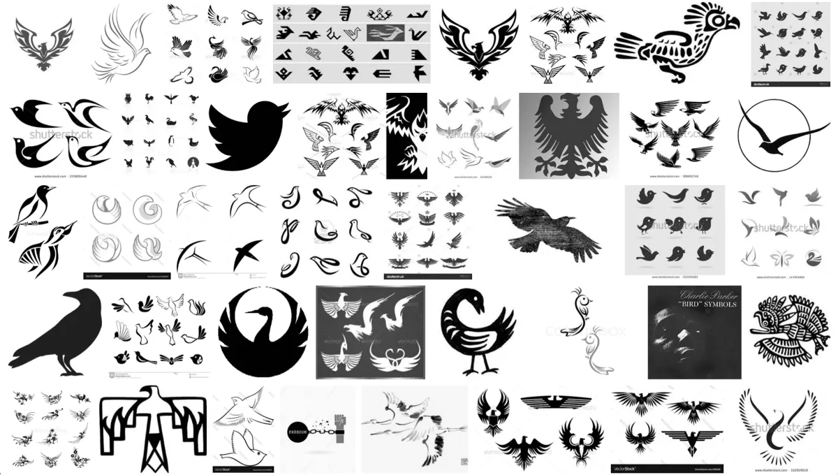
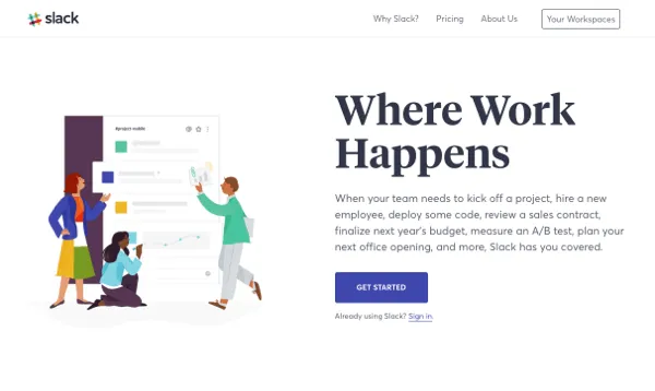
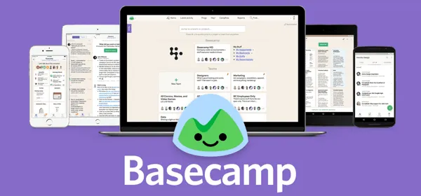
With the name finalized and the brand personality determined, I needed a little more research. Who was Bertie Forbes? What does the word "bertie" evoke? How do similar products brand themselves?
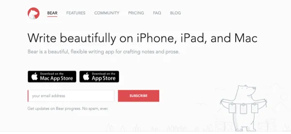
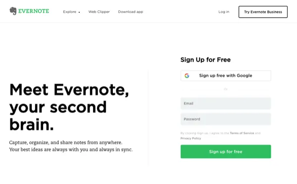
Giving Bertie a Voice
The brand personality spectrum described a user who needed to feel welcomed and secure, and who wanted something fresh, modern, and accessible with a hint of playfulness. With that in mind, I explored typefaces, color themes, and logotypes.




Beyond imagery that evoked 'bertie,' I wanted the mark to convey what users were coming here to do, which is storytelling and publishing. I explored ideas around text editing, quills (which tied back to the bird theme), and type-writing.
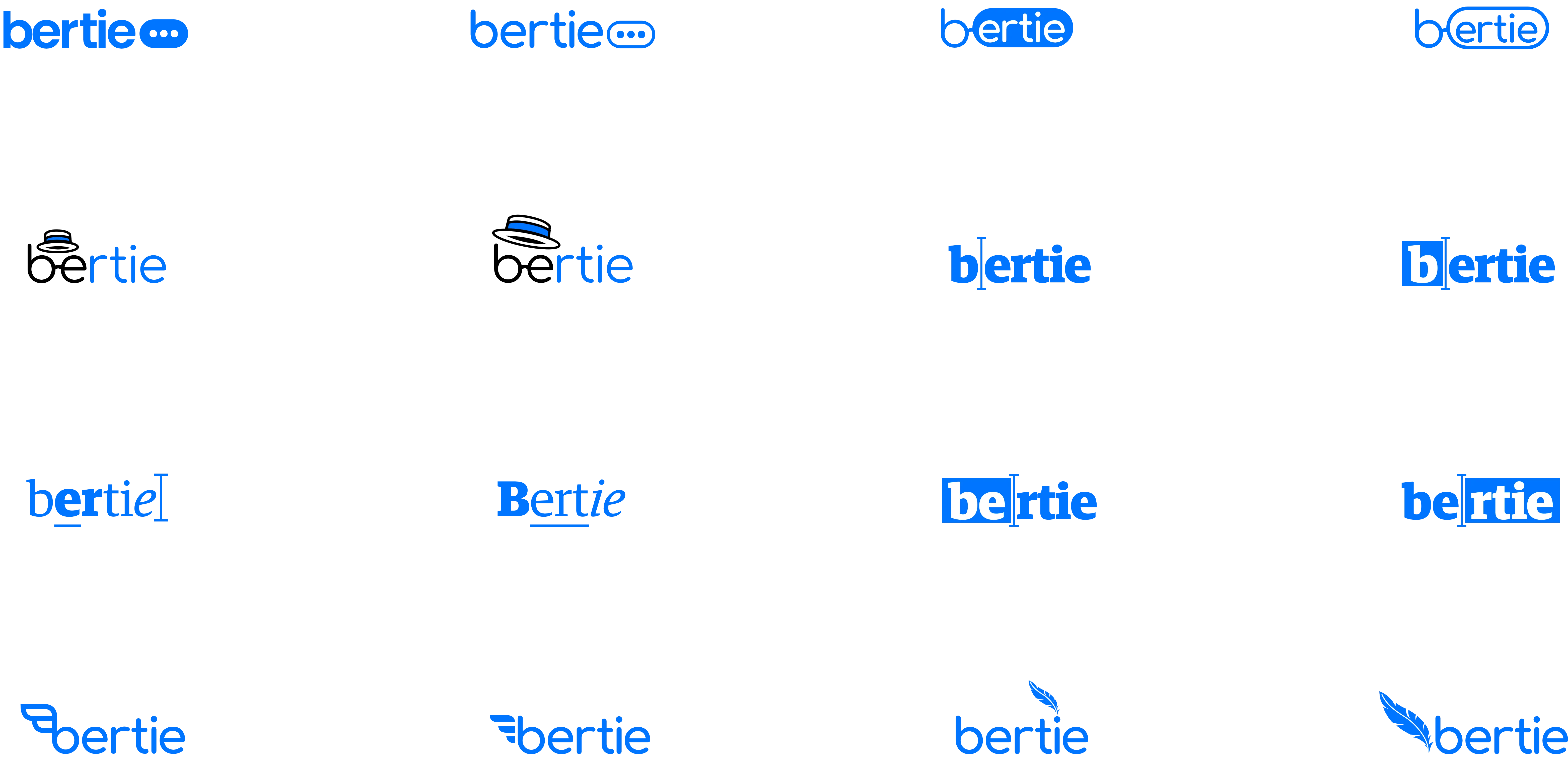
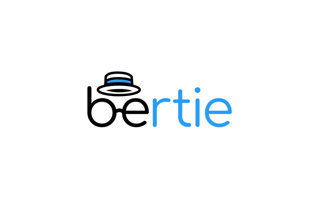
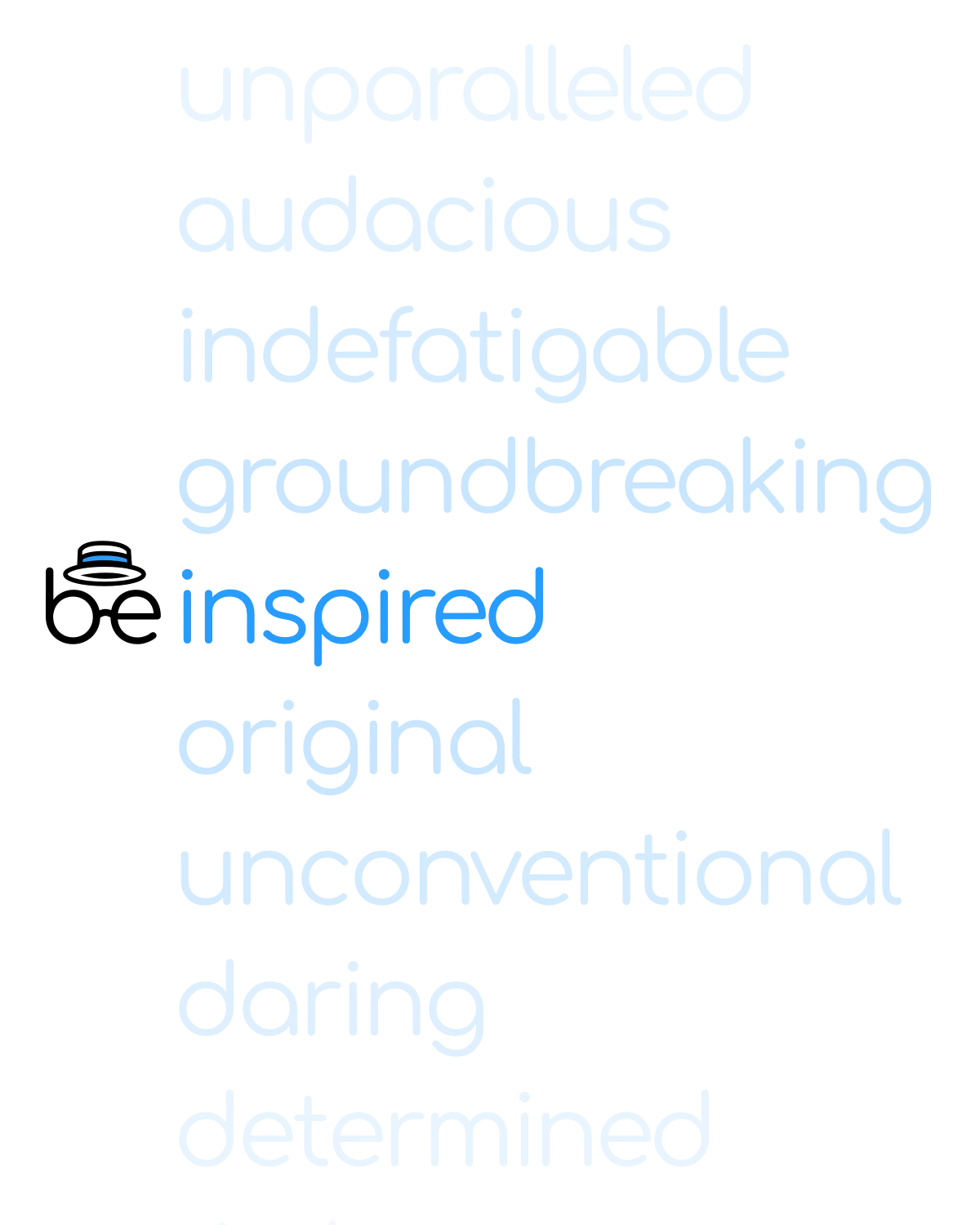
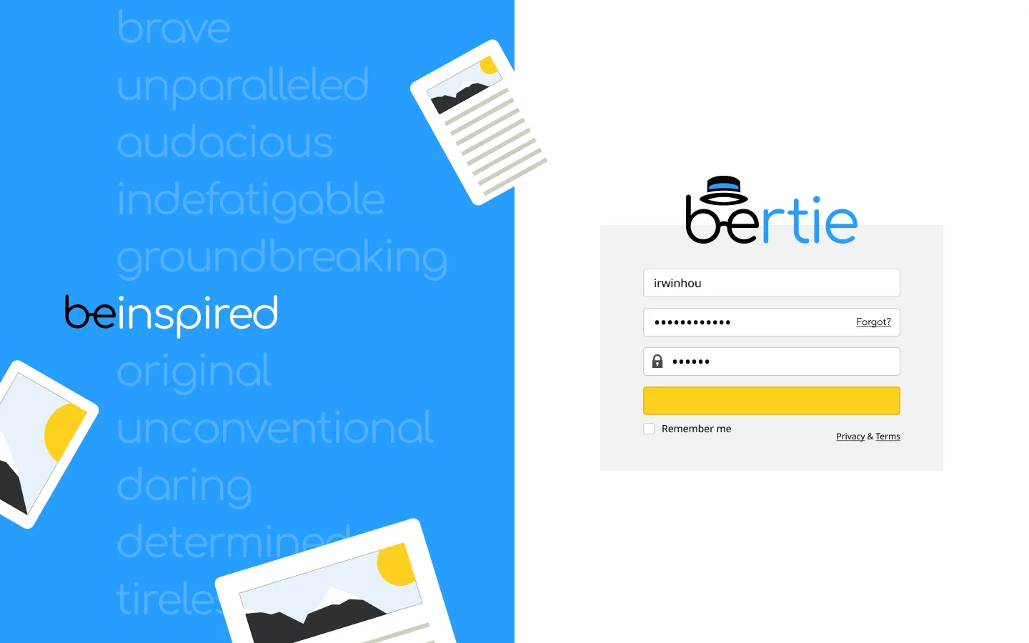
It came down to three, and the logo with the top hat won. Set in Comfortaa, a rounded geometric sans-serif by Johan Aakerlund, the 'b' and 'e' are joined by a bridge that resembles Mr. B. C. Forbes' iconic spectacles, paired with his top hat. With the 'be' in 'bertie' highlighted, I paired it with a list of inspirational adjectives: be inspired, be original, be groundbreaking.
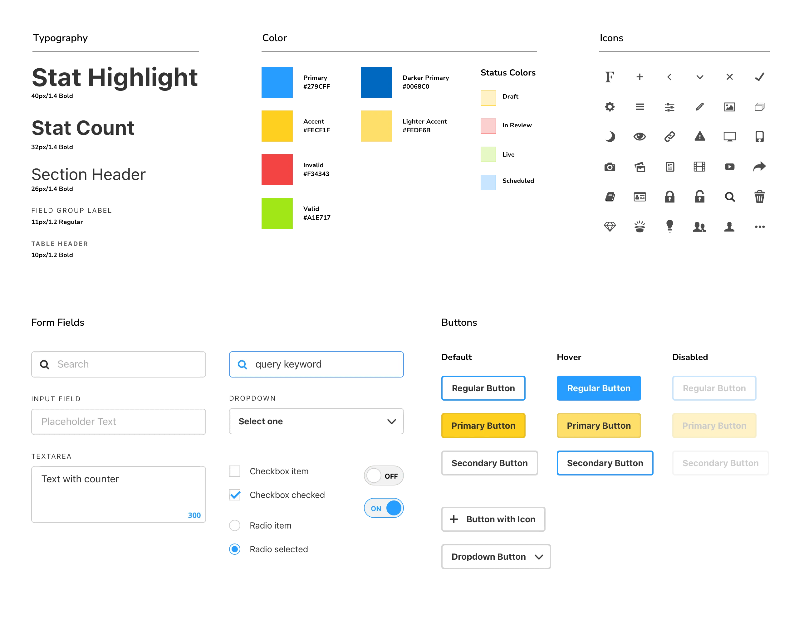
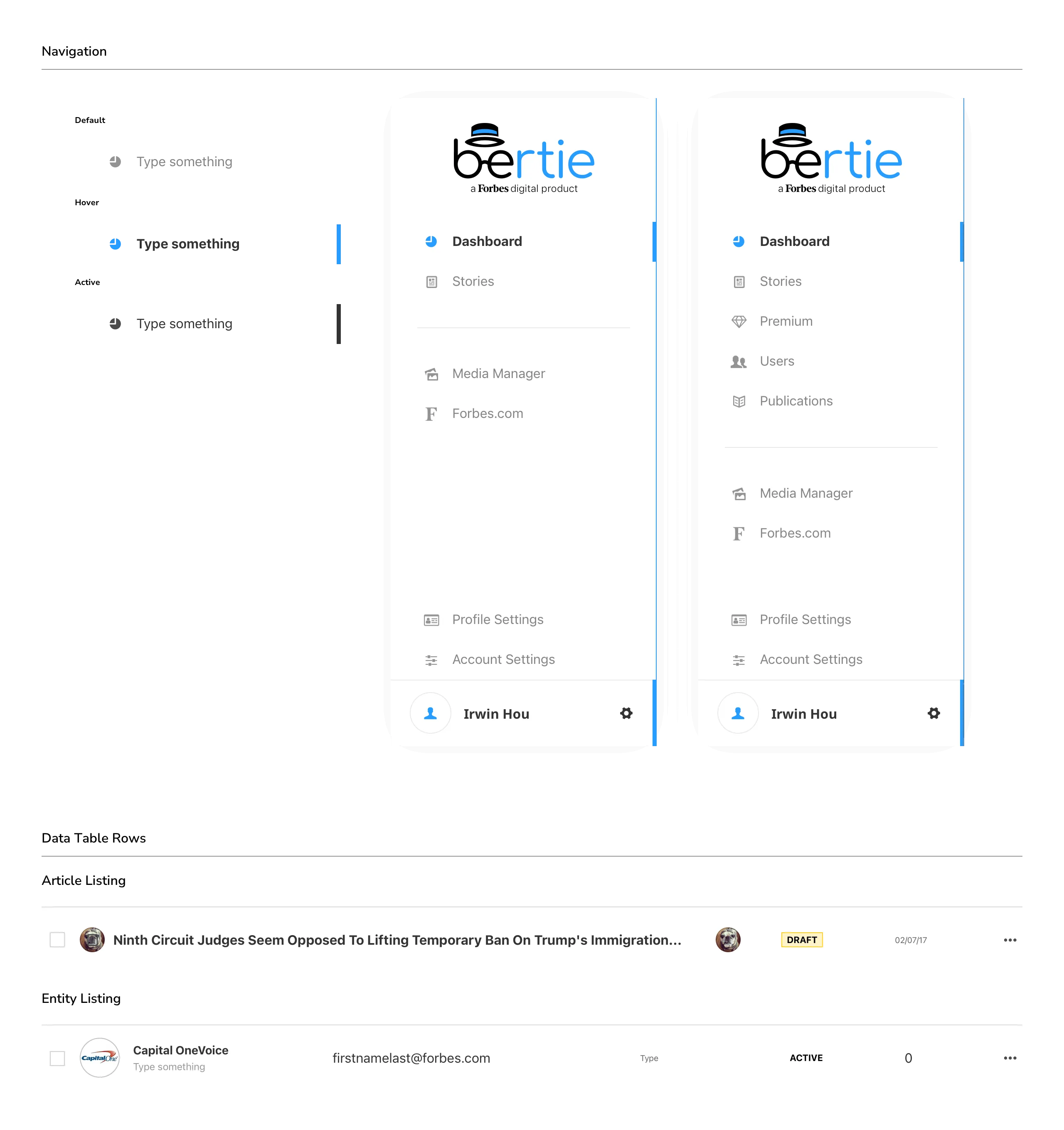
Bertie Component Library
Gathering all the symbols and components across the Bertie screens, I put together Bertie's component library.
Motion
To bring the logo to life and give it more character, I created examples of motion we could use for micro-interactions or to direct attention: an aggressive shake in disagreement for errors, or a tip of the hat when the user does something right.
Bertie.ai
Working closely with our data scientists, we looked for ways to turn data collected from users into assistance back to the user. As people performed certain actions on the platform, the system learned from their behavior and preferences and offered recommendations in return: article topics based on what an author had written before, headlines drawn from the sentiment of the piece in progress, and images to go with it.
The constraint we set early was that Bertie suggests, it doesn't write. Everything the system produced had to be something a writer could take, edit, or ignore without friction, which meant suggestions had to appear near the work without interrupting it and had to be dismissible in a single gesture. A suggestion that demands a decision isn't assistance.
- Read more about it
Responsive Prototyping
I'm a huge proponent of responsive design, and I like building fully functional prototypes to test my designs. As someone whose desktop windows are often at various sizes and positions, I make sure my designs adapt to any size.
Using Serve (a Rack-based web server), I hand-coded the HTML and CSS and turned my static designs into a working prototype I could test in a browser. I created a repository on the company GitHub and shared it with the dev team, then worked closely with developers as they built out each component. This made handoff much smoother.
Results
Bertie launched in July 2018 and has been responsible for the creation of all Forbes.com content since. At launch it served 2,800+ journalists, contributors, and BrandVoice partners publishing 300+ stories daily. In the months that followed, Forbes doubled its monthly loyal visitors and reached a 12-month traffic high of 65 million monthly uniques in November 2018.
Those are Forbes' numbers more than they are mine. The result I'd point to instead is that the platform held. Bertie was built to replace a CMS that had become unmaintainable after a decade of plug-ins and hacks, and the risk in building from scratch was that we'd simply reset that clock. We didn't. Five years after launch, the engineering team was still building on it, publicly documenting an upgrade of Bertie to Angular 16 in late 2023. The component library, the editing model, and the publishing flow I designed were durable enough to be worth investing in rather than working around, which for a platform whose predecessor collapsed under its own extensions is the outcome that mattered.
- Read more about it
Looking Back
I left Forbes in April 2018, about three months before Bertie launched. That's the honest limit of this case study. I don't have post-launch numbers on the decisions I made, and I never got to sit down with a writer six months in and hear what actually worked.
That gap sits heaviest on the AI. We started designing those features in 2017, several years before large language models made machine-assisted writing feel ordinary. There was no established pattern to borrow from and no shared expectation among users about what a suggestion in a text editor was even for. The design problem wasn't the model, it was the posture: how much should the system assert, when should it speak, and how does a writer dismiss it without feeling managed. We landed on suggestions as thought starters rather than output, surfacing recommended topics, headlines drawn from the sentiment of a piece, and images, always as something the writer could take or ignore. Reading the coverage after launch, that restraint held. Forbes described the tools publicly the same way we'd designed them, as prompts to get a writer moving rather than drafts to publish.
What I don't know is whether writers trusted them. Trust was the thesis of this entire project, since the finding that shaped it was that people wouldn't draft in a tool they didn't believe in. Building a platform writers would compose in was one version of that problem. Getting them to accept a machine's opinion on their headline was a harder one, and I designed for it without ever finding out if I got it right. If I picked this project up again, the first thing I'd want is that data.