Model Edge
Modernized a model risk governance platform, simplifying dense compliance records into something reviewers can navigate without losing the depth regulators require.
- Platform
- Desktop Web App
- Team
- UX Designer (me)
- 1 Product Owner
- 2 Product Managers
- 1 Lead Developer
- Dev Team (overseas)
- Status
- Launched
- Overview
Model Edge is a cloud-based platform for managing, monitoring, testing, and governing model portfolios. It supports the end-to-end model lifecycle and gives institutions a centralized view of their models, along with a way to explain their use of models and AI to stakeholders. It was developed in-house at PwC.
The platform is organized around six areas: a Home dashboard, an Inventory of all models with a full profile for each, Performance monitoring, Reports, Approvals, and an Audit Trail.
- My Role
I joined the team to transition the existing platform to a new design system and polish the UX/UI, and my role expanded from there. I ran usability research with beta users and worked across all six sections of the platform. That ranged from redesigning the Inventory and profile experiences around problems the research surfaced, to fleshing out the governance sections that carry the model lifecycle. I hand-coded the interactive prototypes and worked with PMs and lead developers through specs and handoff. I owned the product through MVP completion and transitioned it to another designer as it moved into ongoing feature work.
Background
Much of the MVP had already been designed for beta release, so my goal was to identify usability issues in the beta, understand user needs and pain points, and determine what to prioritize next.
Before joining, I wasn't familiar with financial models or model risk management. Getting up to speed mattered more than it might sound, because the users of this platform do model risk work professionally and I needed to understand what they were accountable for before I could design for them.
- What is a model?
- A model in finance is a tool that helps make decisions. It's a mathematical or computational representation of a real-world financial situation or system, used to forecast events, evaluate risk, and make predictions based on various inputs and assumptions.
- What is model risk?
- Models are simplifications, so they're never exactly right. Model risk is the chance that a model gives a bad answer, or that a good answer gets used the wrong way, and an expensive decision follows from it.
- What is Model Risk Management?
- MRM involves overseeing the development, implementation, and use of models to ensure they are accurate, reliable, and used appropriately. It covers development and validation, governance, documentation, and ongoing monitoring and auditing. Institutions operating under regulatory supervision are expected to inventory every model in production, validate it independently, document it, and re-review it periodically. That expectation is the reason a platform like this exists, and it shaped nearly every design decision I made.
Discover & Define
Once I got up to speed, I dug into the existing system to find areas that needed improvement and interviewed beta users to understand their workflows and pain points. What came out of those conversations was that the biggest problems weren't visual. They were about finding information inside a lot of it.
- Key Findings
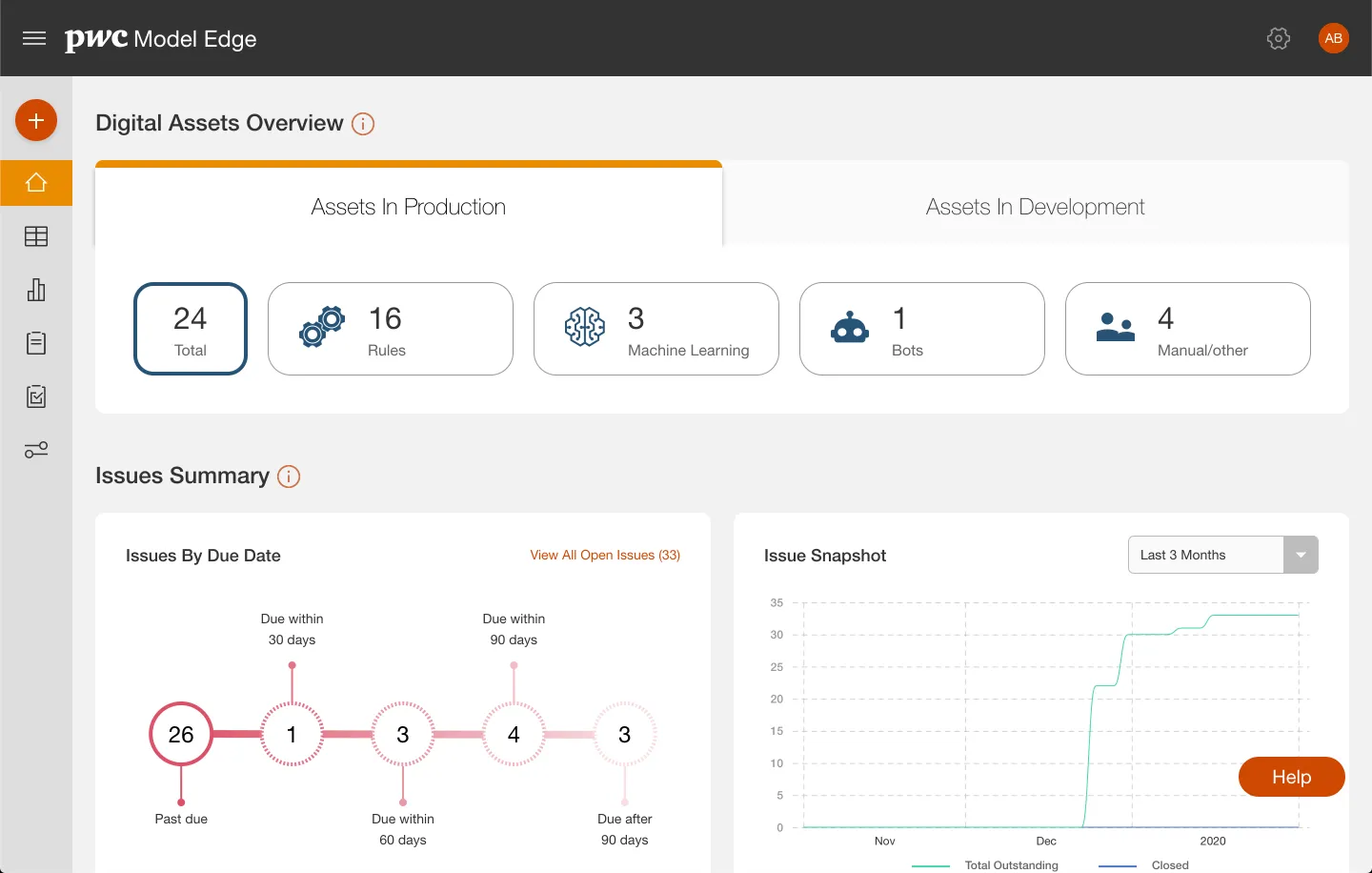
- Users had mixed feelings about the Digital Assets Overview page. Some found the dashboards sufficient, while others were confused and didn't realize there were more charts below the fold.
- Some of the icons were unclear.
- Users wanted more information in their inventory of assets, or the ability to customize tables.
- There were too many steps when adding new content in a modal.
- Asset profiles were hard to navigate and digest because of the amount of content on them.
The instinct here would be to cut content, but that wasn't an option. The fields on an asset profile map to documentation obligations, and hiding something a reviewer is accountable for creates real risk. So I reframed the problem as one of progressive disclosure rather than reduction, which is what most of my "How might we" statements ended up circling:
- Home
How might we display the most relevant and easily digestible information to the user?
- Update Digital Assets Overview section
- Determine what customers want from the dashboard.
- Decide if the Issues Summary section belongs here or in its own section.
- Inventory
How might we make it easier to view the most information of each item before needing to click into the full profile?
- Reinforce icon for each asset type.
- Explore alternative layouts for text-heavy data tables (e.g., card treatment).
- Add search functionality.
- Asset Profiles
How might we make it easier for users to find the information they're looking for in lengthy, data-heavy profile pages?
- Add sectional navigation (jump to section).
- Implement modular edit/save.
- Improve visual hierarchy (e.g., why is asset ID the largest text?).
- Find opportunities to inject icons or visual elements.
- Explore layouts that better use white space and truncate unimportant/excess content.
- Consolidate all action items (Create Report, Edit, Export, Print).
- Overall UX/UI Improvements
- Utilize shadows to add depth.
- Explore typographical treatments for heirarchy
- Update primary color to the new theme.
- Address inconsistent form elements.
- Incorporate a grid system.
- Update the header.
- Ease transitions.
- Update the FAB button.
Ideate & Iterate
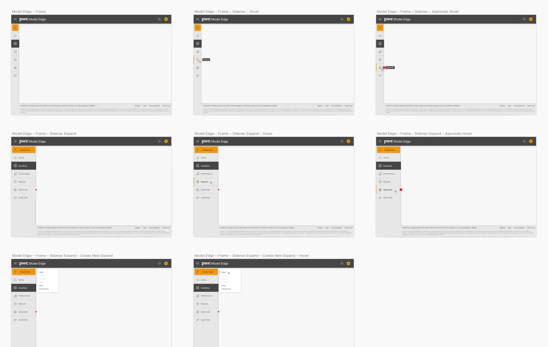
I started with the foundational elements, built out a component library, and updated the header, footer, and left-side navigation to the new design system.
The bigger challenge was the design system itself. I was expected to build from its existing components, and those components weren't built for data at this volume. Rather than deviate from the system, I worked to extend it, pushing the table components to support expandable rows that reveal the most-requested fields and quick actions inline without a page load. That extension became a modular pattern that got reused beyond the screens I originally designed it for.
On profiles I paired sticky sectional navigation with modular edit and save, so the full record stays intact but becomes something you can move through and edit in pieces instead of as one long form.
Concept Testing
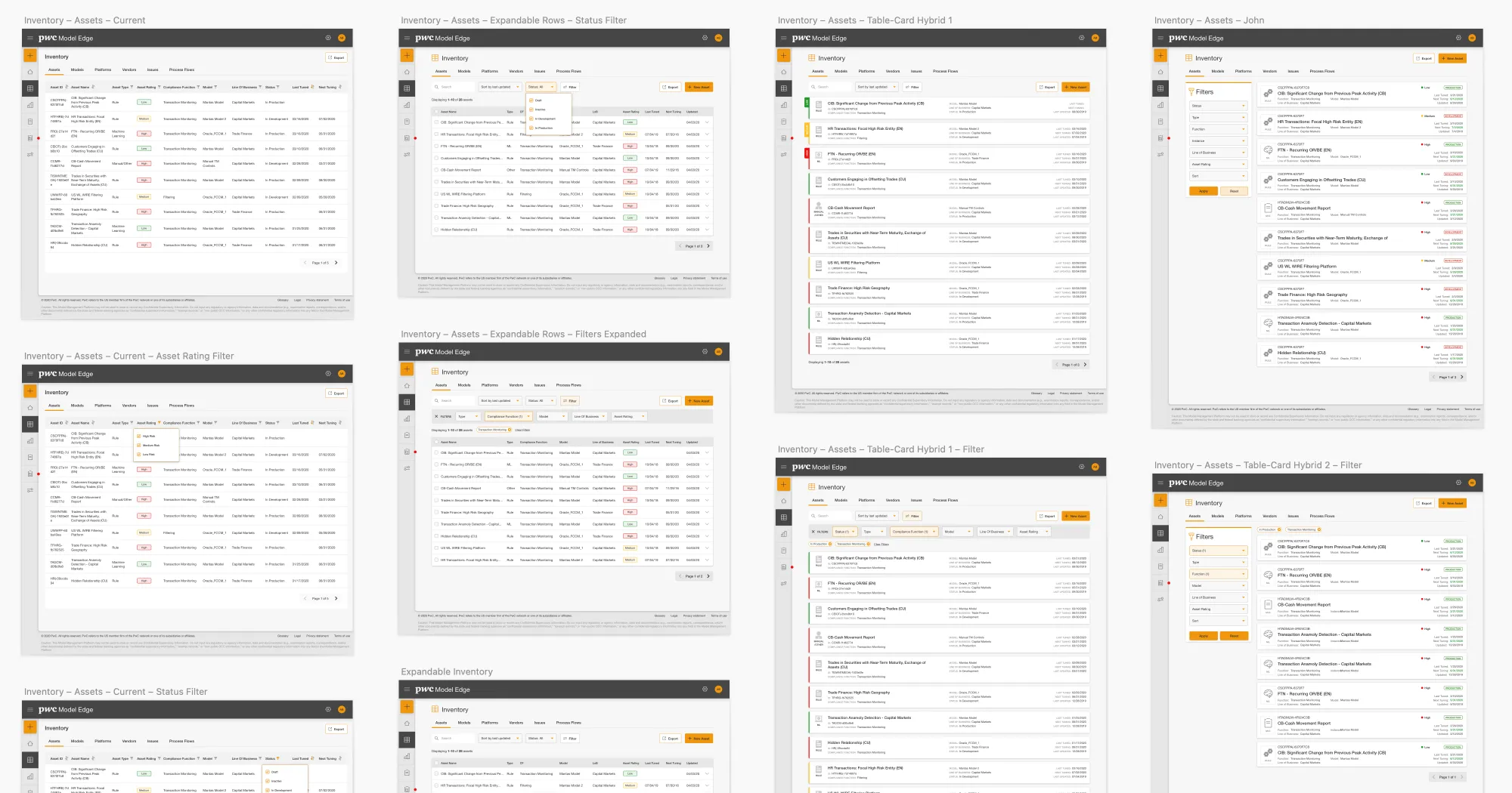
As multiple options took shape, I ran moderated sessions comparing concepts side by side. For Inventory, a horizontal card layout with an exposed filter panel against dynamic tables with expandable rows. For profiles, tabbed modular sections against a reorganized layout with a sidebar of key information, and two treatments of sticky navigation.
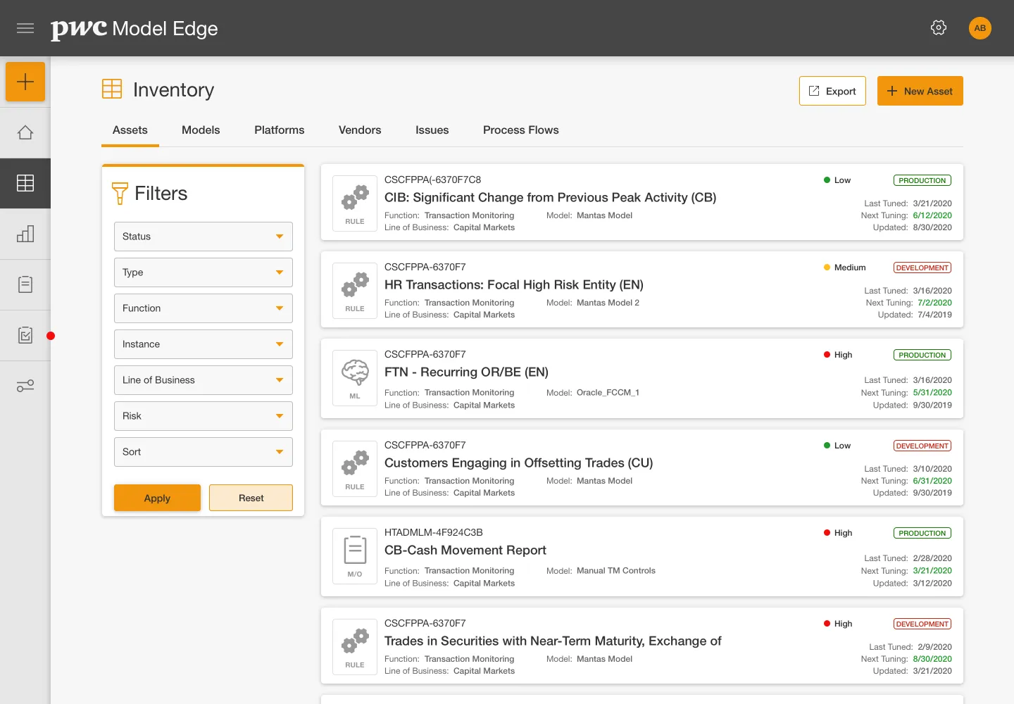
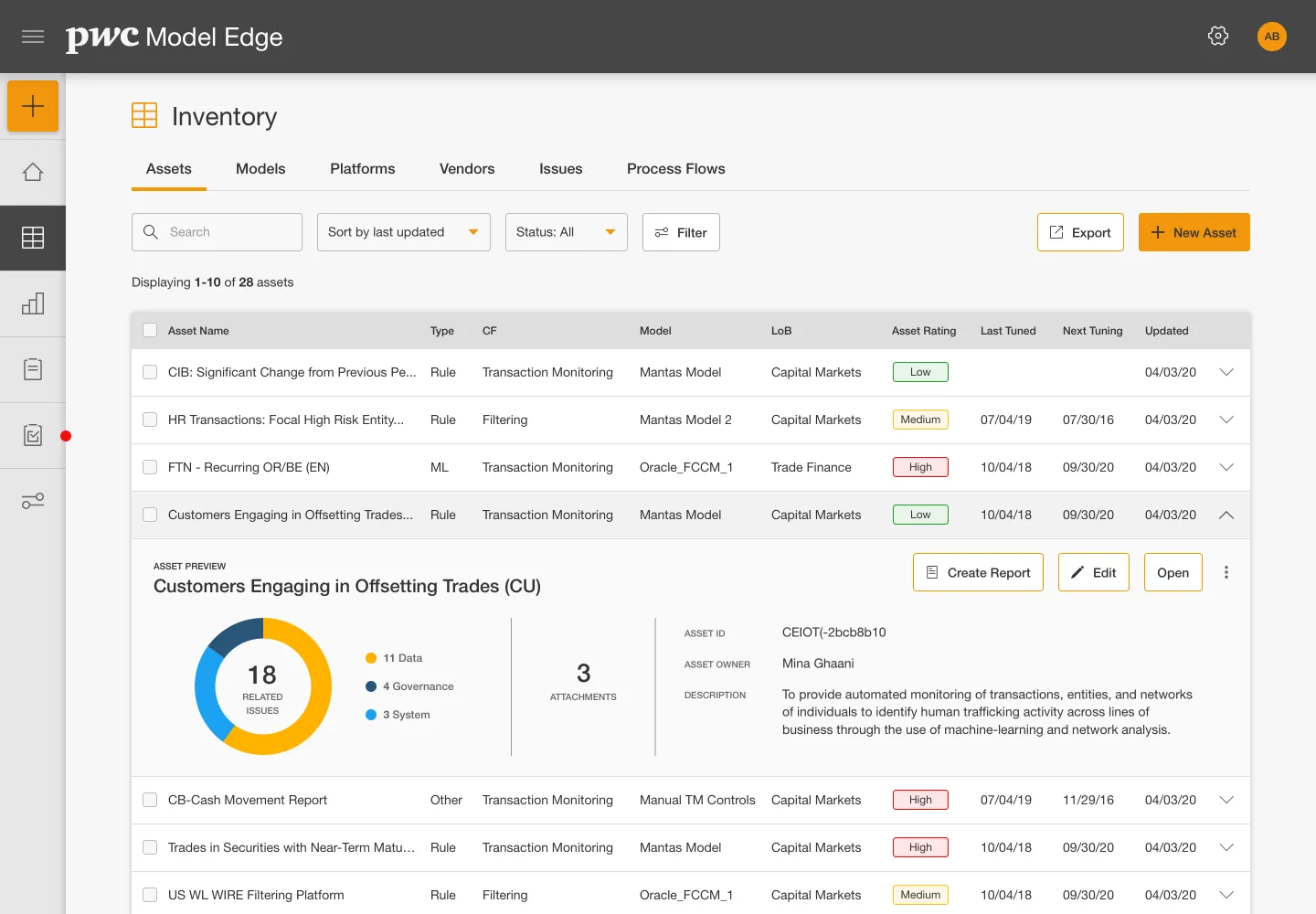
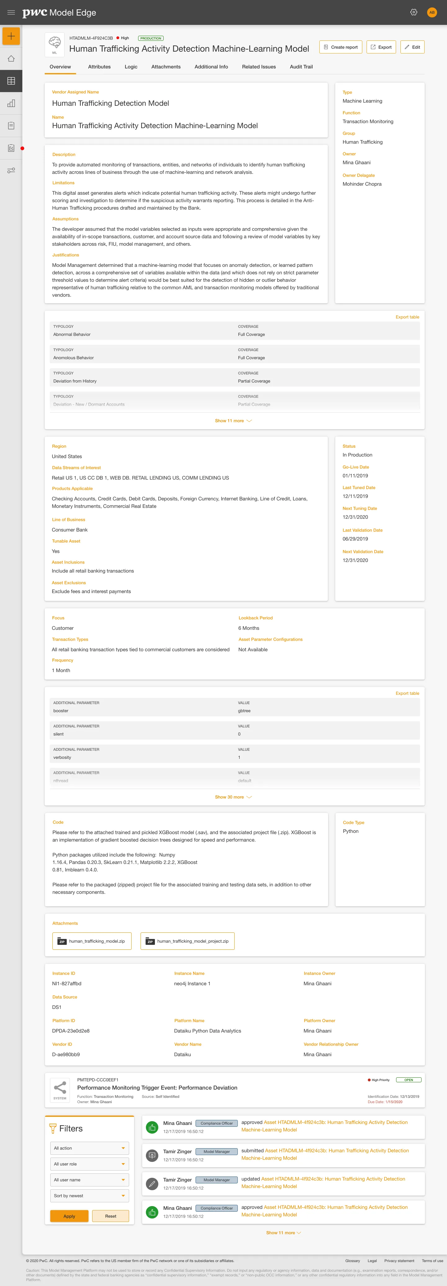
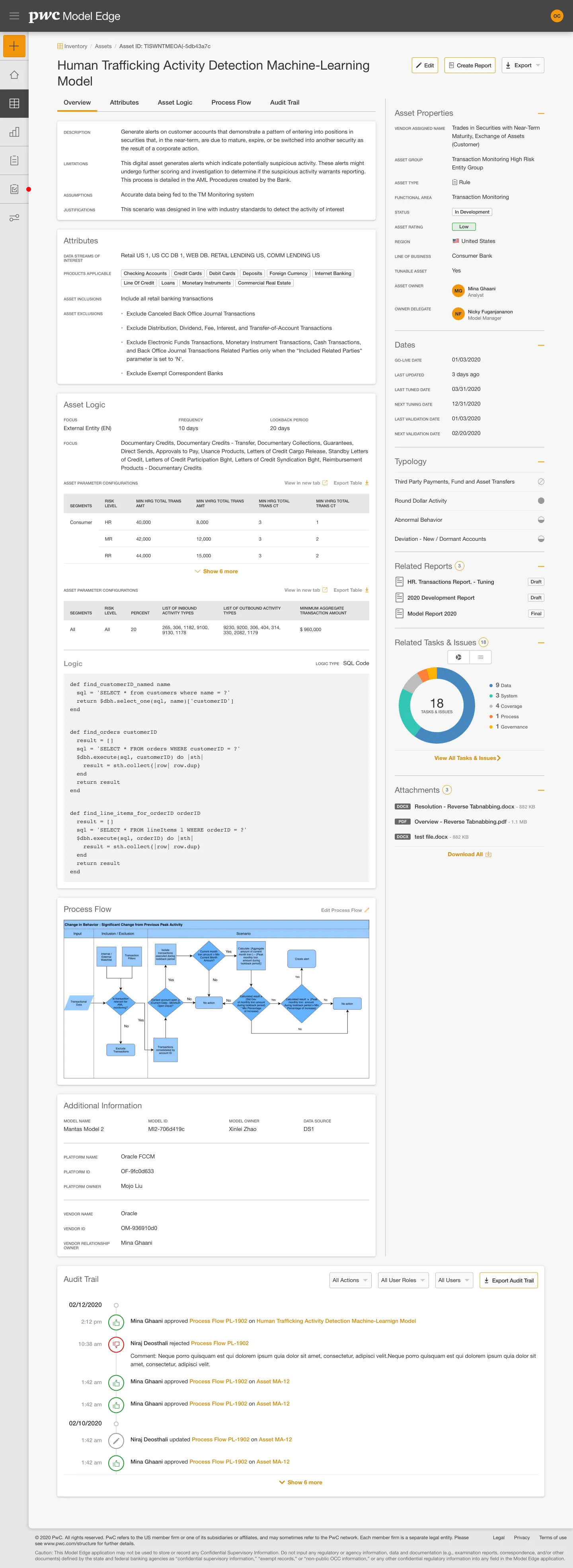
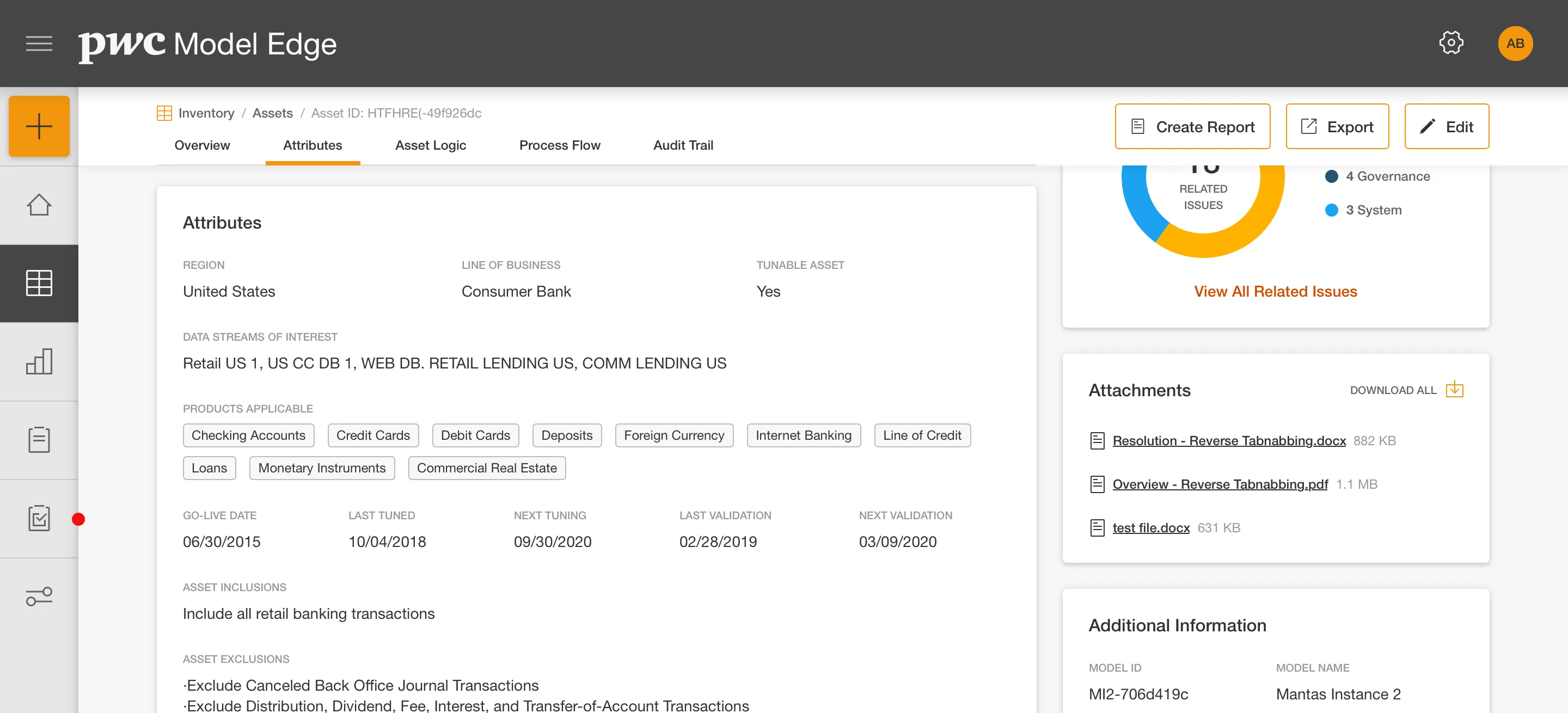
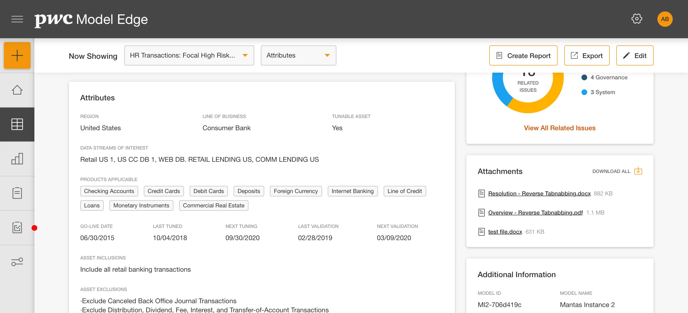
The sample was small and drawn from the beta user pool, so this was directional input to help choose a direction rather than statistical validation. The expandable table and sticky navigation concepts resonated most clearly, and those are the ones I refined.
Governance & Audit
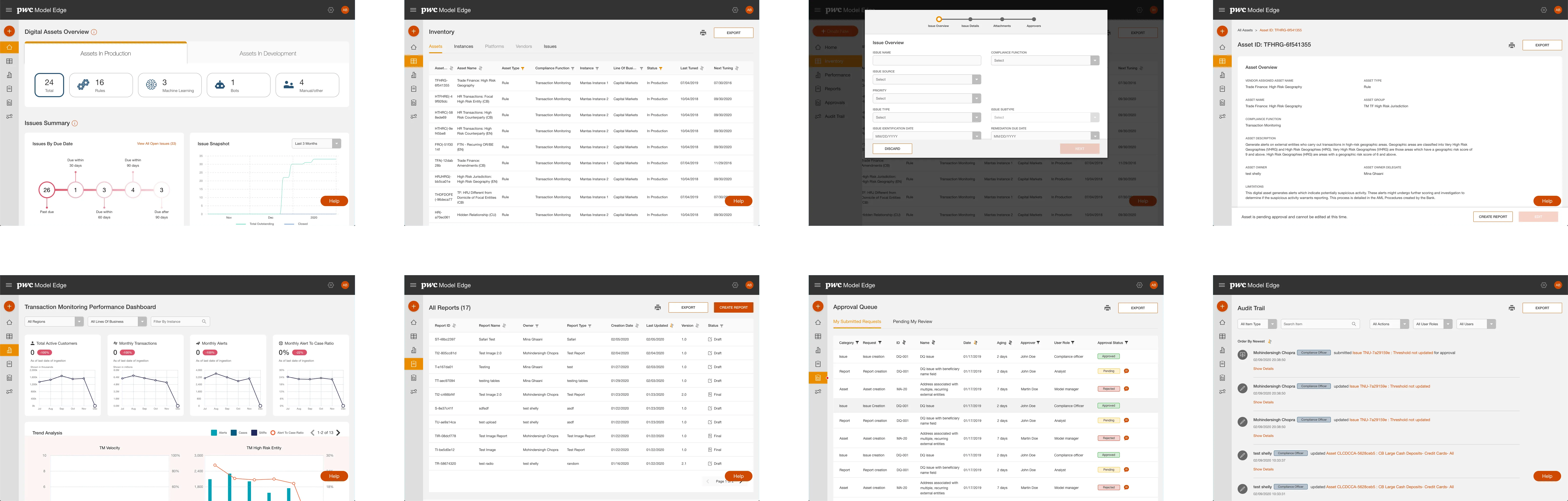
In addition to the main Inventory section, I worked on the remaining sections that carry the platform's governance function: Performance, Reports, Approvals, and Audit Trail, each a top-level area of the product. These weren't fixes to existing screens. They were parts of the model lifecycle the platform still needed to support, and designing them meant treating every action as something that would be recorded and later defended.
Rather than build change highlighting separately for each section, I designed it once as a shared capability, so reviewers can see what moved between versions without re-reading an entire record.
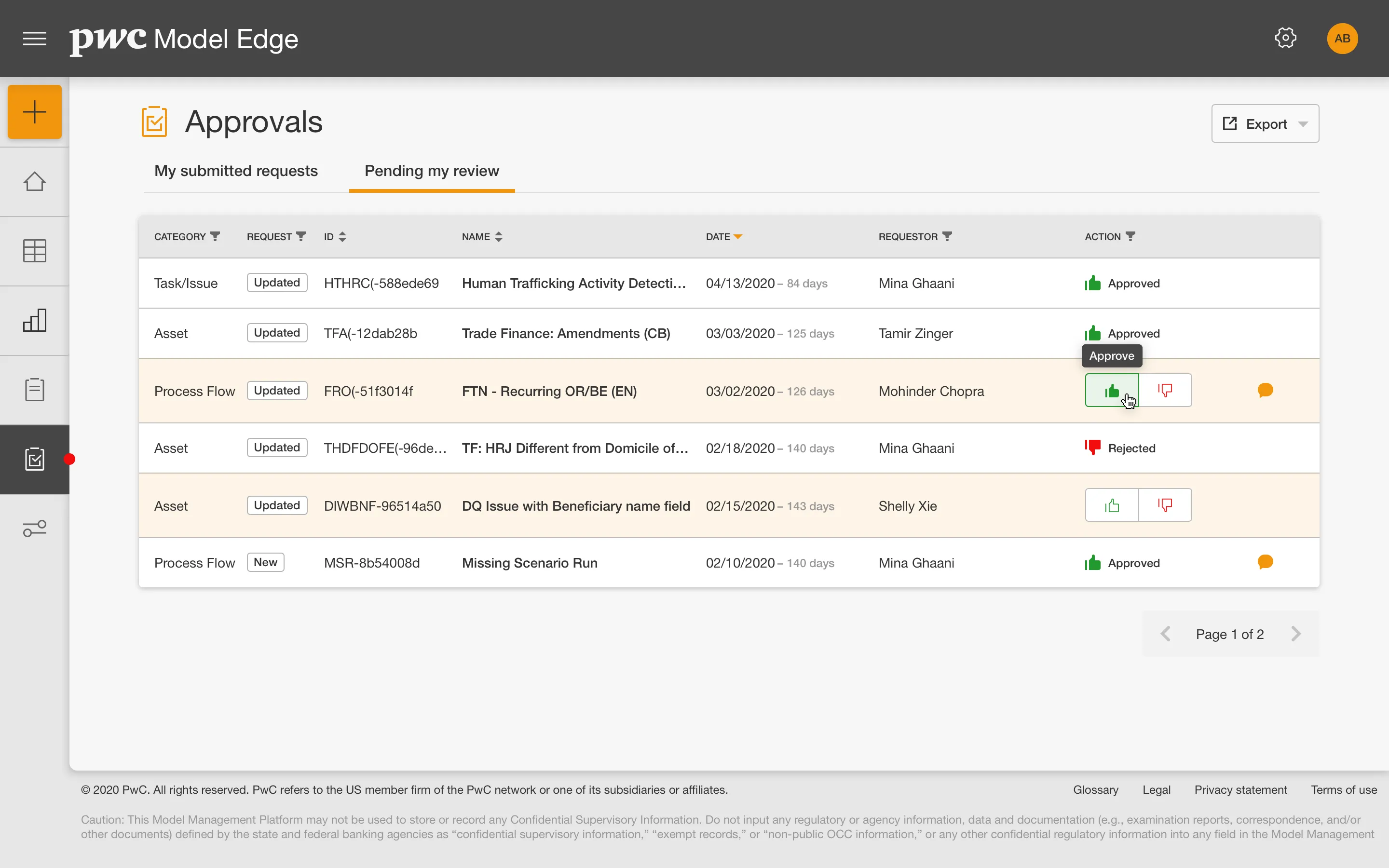
Model documentation exists to be reviewed and scrutinized, and that scrutiny is most acute in the approval flow, where each state needs to be legible: what's pending, who it's waiting on, and what's already been signed off. In a governance context, the status of a review is as important as its content.
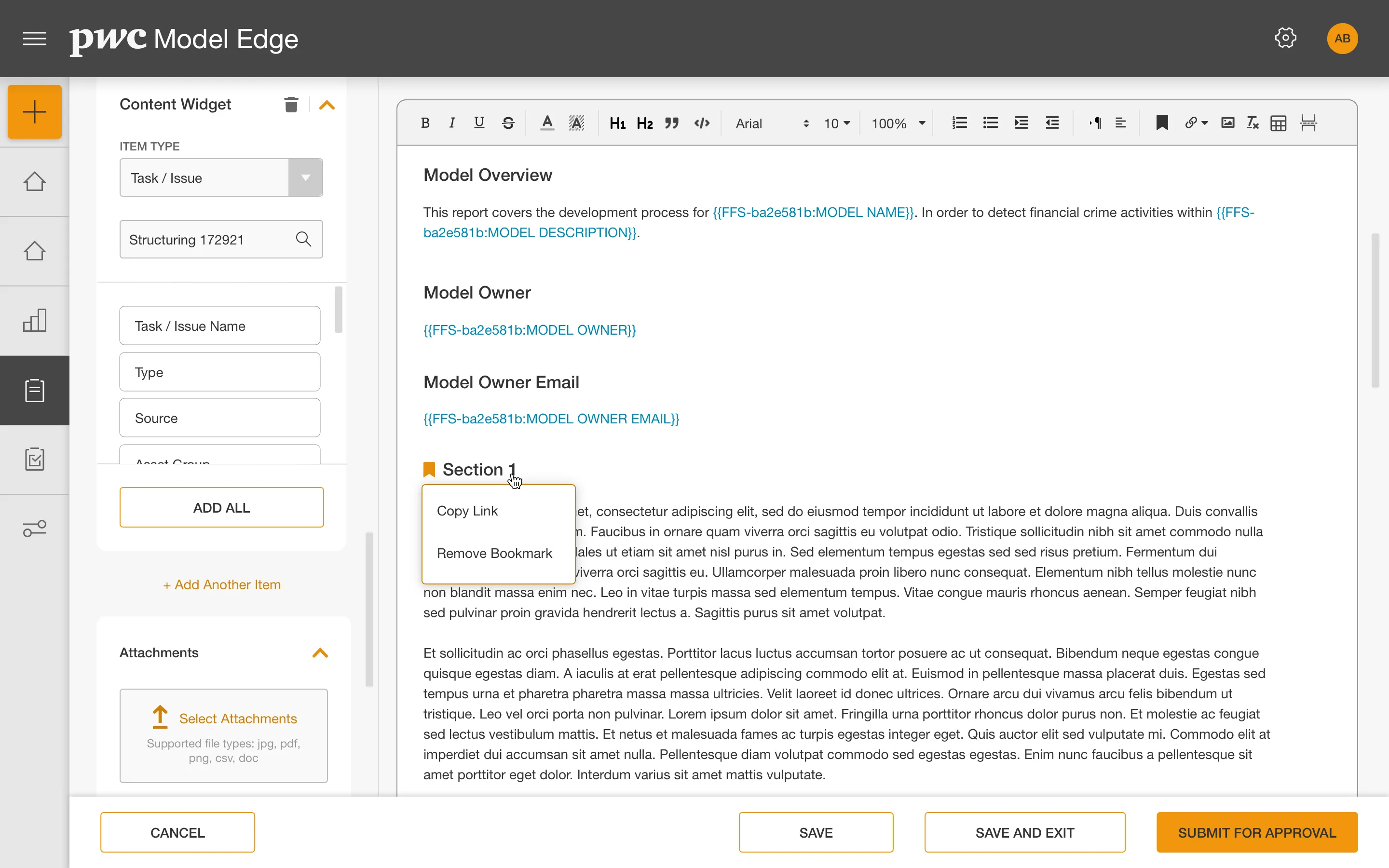
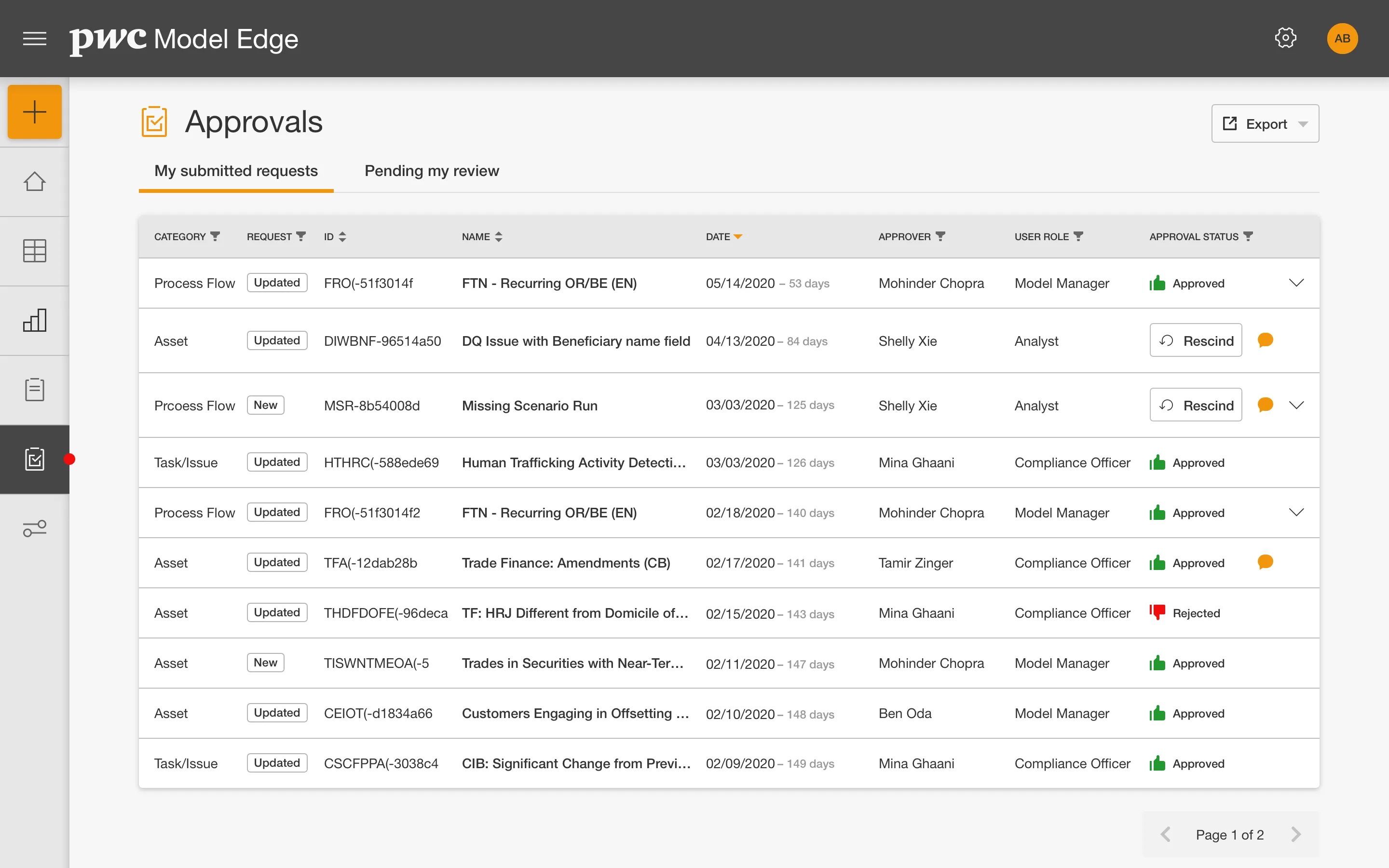
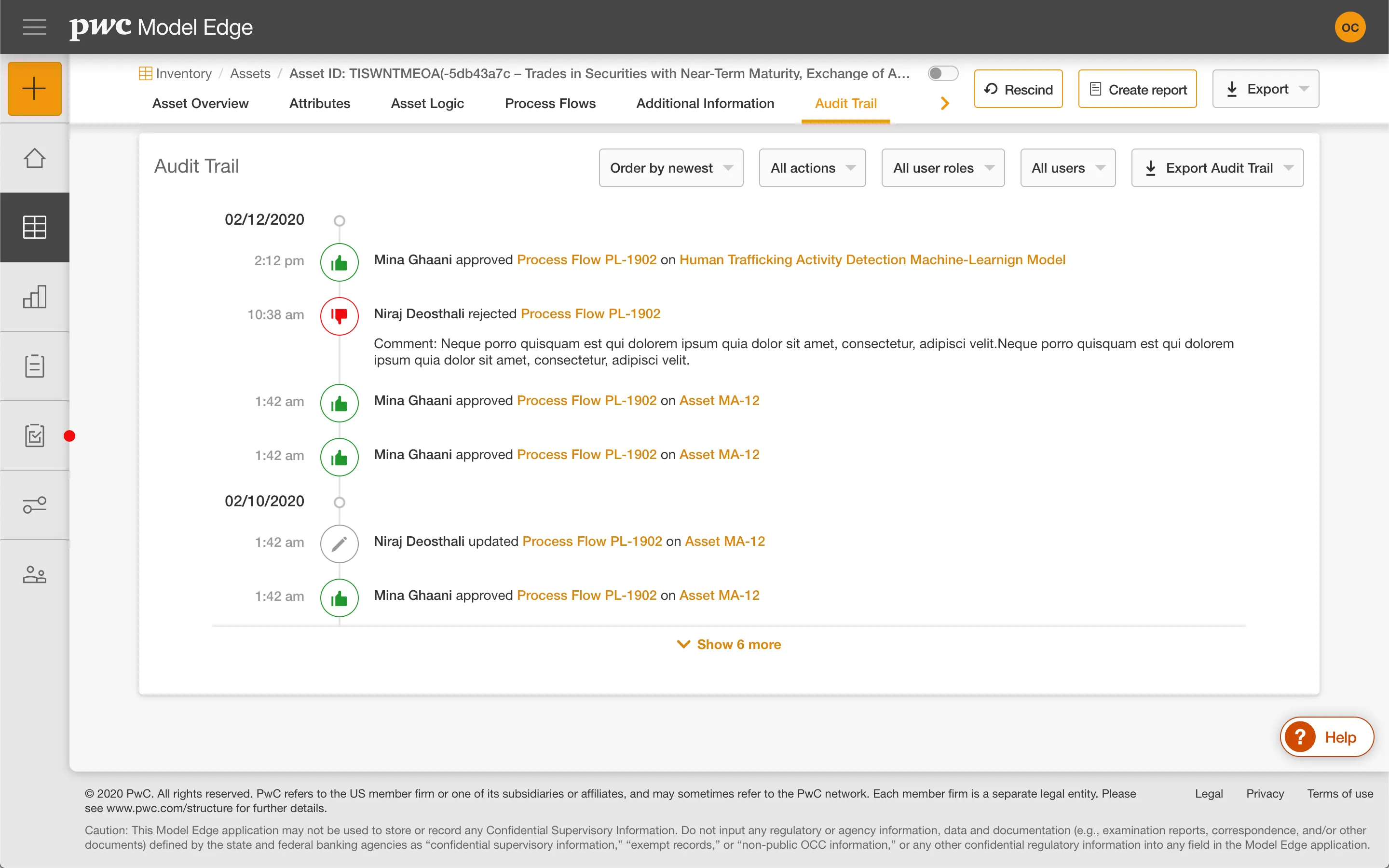
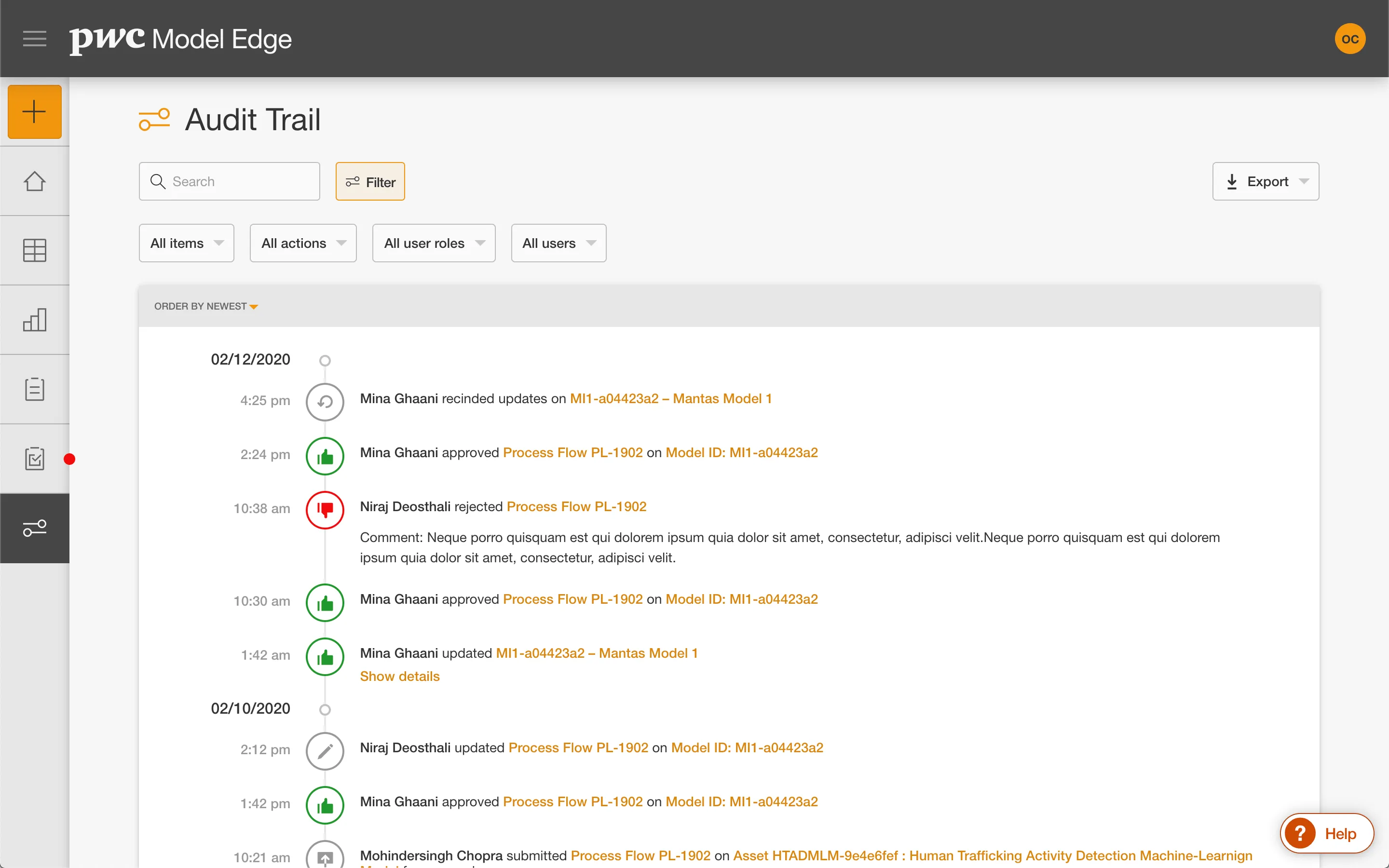
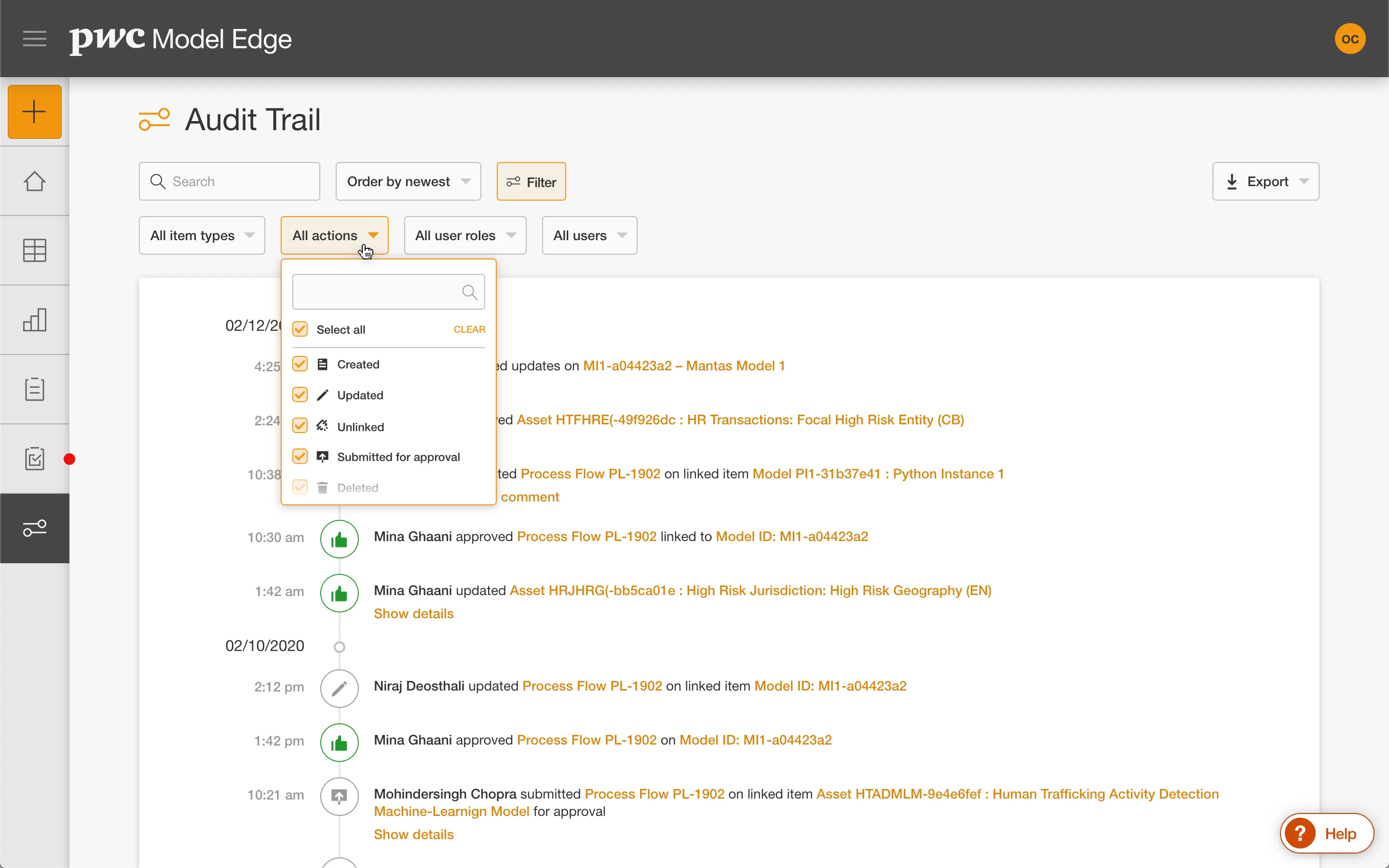
Both of these write to the Audit Trail, which had its own section. The challenge there is that a complete history is by definition long and mostly routine, but the entries that matter (a material change, a rejected approval, a re-validation) are the ones someone is looking for under time pressure. I explored several concepts for making that record scannable rather than exhaustive to read, and tested them with beta users.
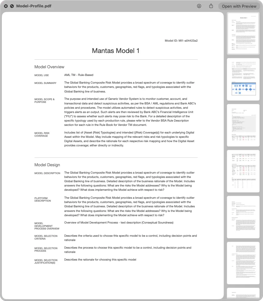
I also designed the exported output, including the printed and PDF versions. This was a different design problem from the screen work. There's no viewport, no scroll, and no interaction, and the document has to hold up on its own once it leaves the platform. That meant thinking about pagination and where content breaks, how tables behave when they cross a page, and what identifying information carries in headers and footers. The exported report is often what actually reaches a regulator or an audit committee.
Accessibility
The design system already adhered to WCAG guidelines, so the foundation was sound. My job was making sure the patterns I built on top of it held that standard, since dense tables, expandable rows, sticky navigation, and modal content entry all introduce accessibility risk at the point of composition rather than the component level.
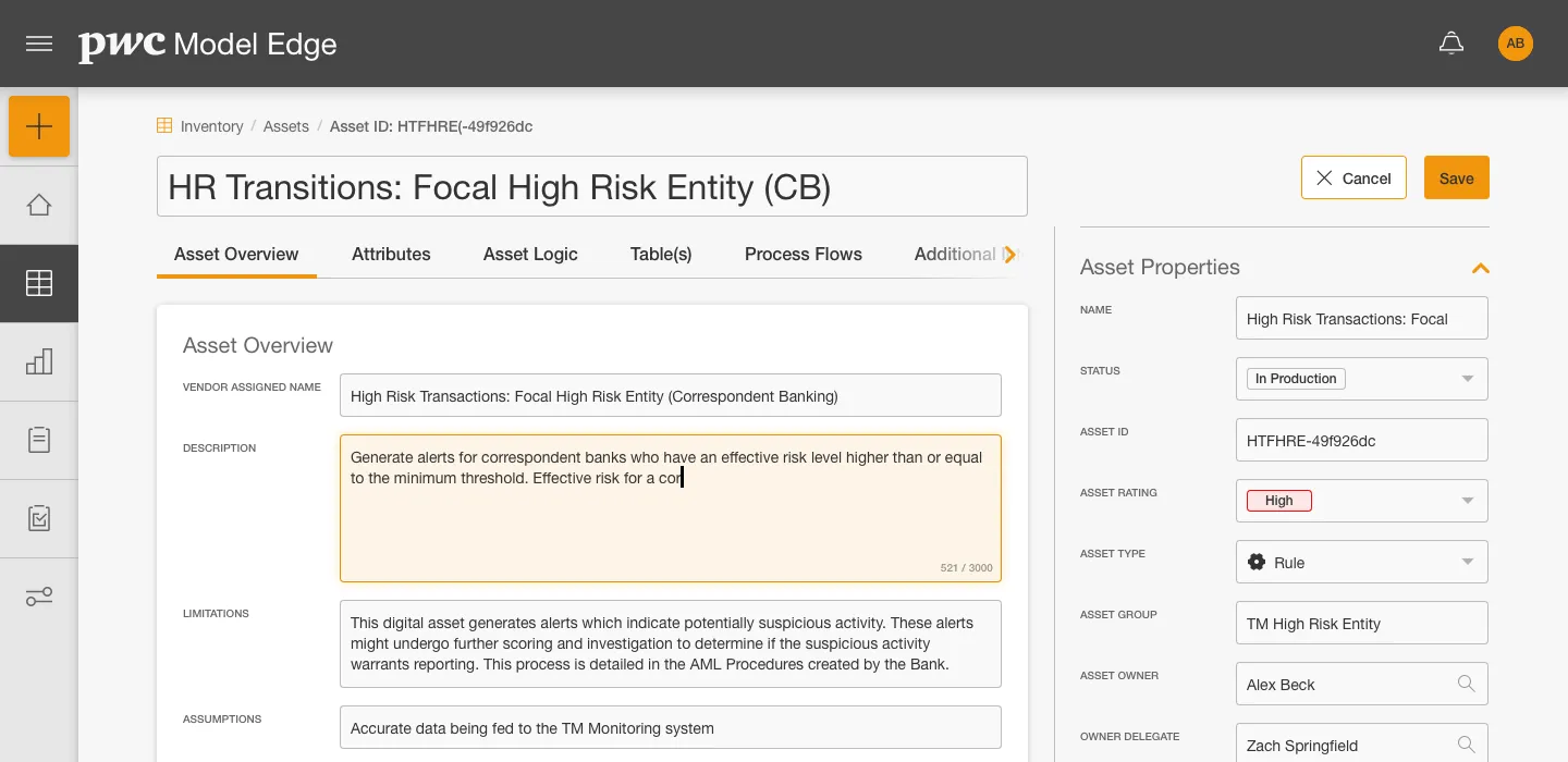
Practically, that meant every interactive element had a visible keyboard focus state and could be reached in a sensible focus order, icons carried accessible names rather than relying on shape alone, and images had meaningful alt text. The parts that needed the most attention were the ones where information appeared or moved visually, such as expanded row content, sticky section navigation, and modal flows. Those are the cases where something obvious to a sighted mouse user can be silently unavailable to someone using a keyboard or a screen reader.
Prototyping & Handoff
After gathering feedback, I hand-coded prototypes in HTML, CSS, and JavaScript rather than sharing static designs. This allowed me to test behavior that's difficult to convey, like transitions between hover and expand states, scroll behavior of sticky elements, and how content overflow should be handled.
Working this way also changed the handoff. I shared the prototypes on GitHub alongside guidelines and specs, so developers had interactive prototypes to reference rather than a static designs to interpret. I partnered closely with the lead developers and PMs, and the documentation covered the things that would otherwise have to be inferred from the designs, such as empty and default states, how users clear data, and how a collapsible column reacts to scroll events.
Results
Model Edge launched in December 2020 and is still an actively marketed PwC product today.
I completed the MVP and handed the work off to another designer as the product moved into ongoing feature work, so I don't have post-launch metrics on the specific changes I made. What I can point to is that the patterns shipped and have held up: the redesigned Inventory and profile experiences addressed the findability problems that came out of the beta research, the governance sections I designed became the platform's audit and approval backbone, and the modular table approach I developed to work within the design system's constraints was reused well beyond the screens I originally built it for.
- Promo Video
Play
- Recognition
- 2023 Risk Technology AwardsGovernance, Risk, and Compliance Product of the Year