Mobile Infographic
Transformed Forbes' signature list content into mobile-first interactive infographics that turned static rankings into story-driven experiences.
- Platform
- Mobile Web App
- Team
- UX Designer (me)
- 1 Product Owner
- 2 Product Managers
- 2 Senior Developers
- Status
- Retired
- Overview
This project began as a challenge: could we create an interactive infographic tailored for mobile, using Forbes' extensive list database? With the Mobile PWA launch, a growing mobile audience, and attention spans reportedly shorter than that of a goldfish— which, for context, is about 9 seconds—the goal was to design an experience that delivered easily shareable, bite-sized information—engaging and immersive, yet quick to consume.
- My Role
As the sole UX designer, I was responsible for the conceptual design, user flow, visual design, interactions, rapid prototyping and overseeing the user experience throughout the entirety of the project.
- Recognition
- 2017 MobileWebAwards for Outstanding Achievement in Mobile DevelopmentForbes 100 Greatest Living Business Minds Mobile Infographic
- 2017 Mobile Sites & Apps: Magazine/Editorial Webby Awards HonoreeForbes NFL Valuations New Mobile List
- 2016 MobileWebAward Best Media Mobile SiteForbes America’s Self-Made Women New Mobile List
Challenge
With the mobile PWA project up and running, we aimed to use it as an entry point, allowing users to flow seamlessly into this new interactive infographic experience. Standard charts and graphs are typically hard to consume on mobile due to limited screen size, so we needed to find a new way to represent data optimized specifically for mobile.
Approach
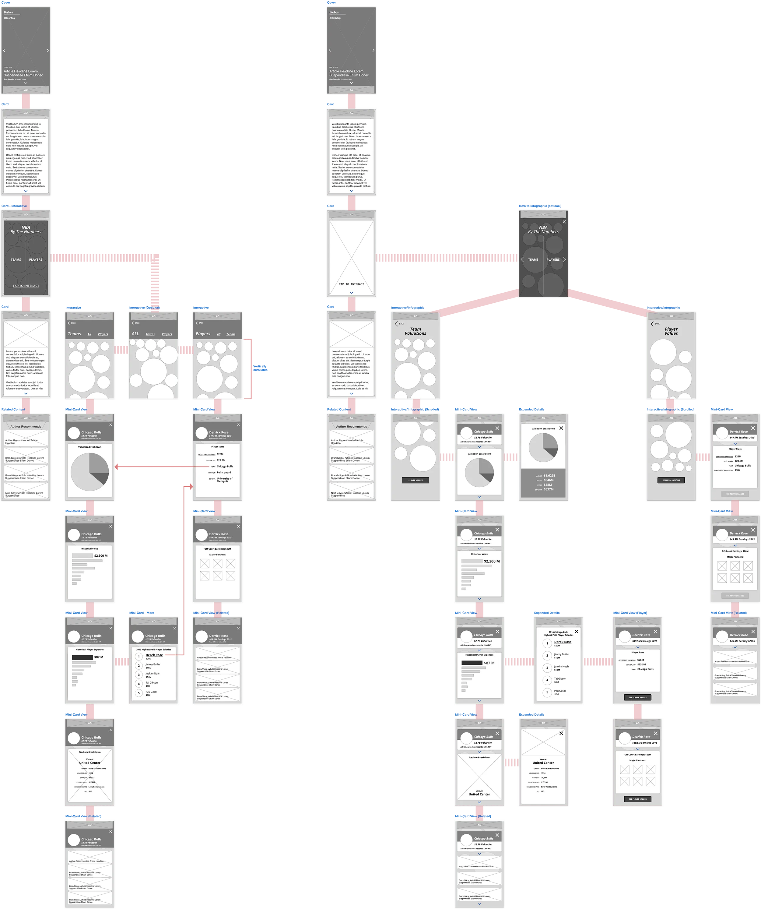


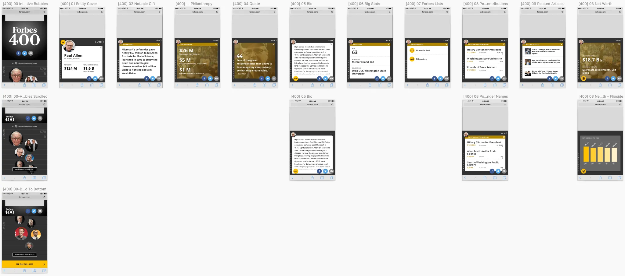
Using an existing infographic as a starting point, I worked closely with the Project Manager to define user personas and create a user flow, exploring different entry points into the infographic. I explored a concept of using the size of the circles to represent an entity’s net worth, while the vertical position indicated their rank. Users could tap each entity to access more information in the form of mini-cards and swipe vertically for additional details or or horizontally to switch entities.
Design and Prototyping
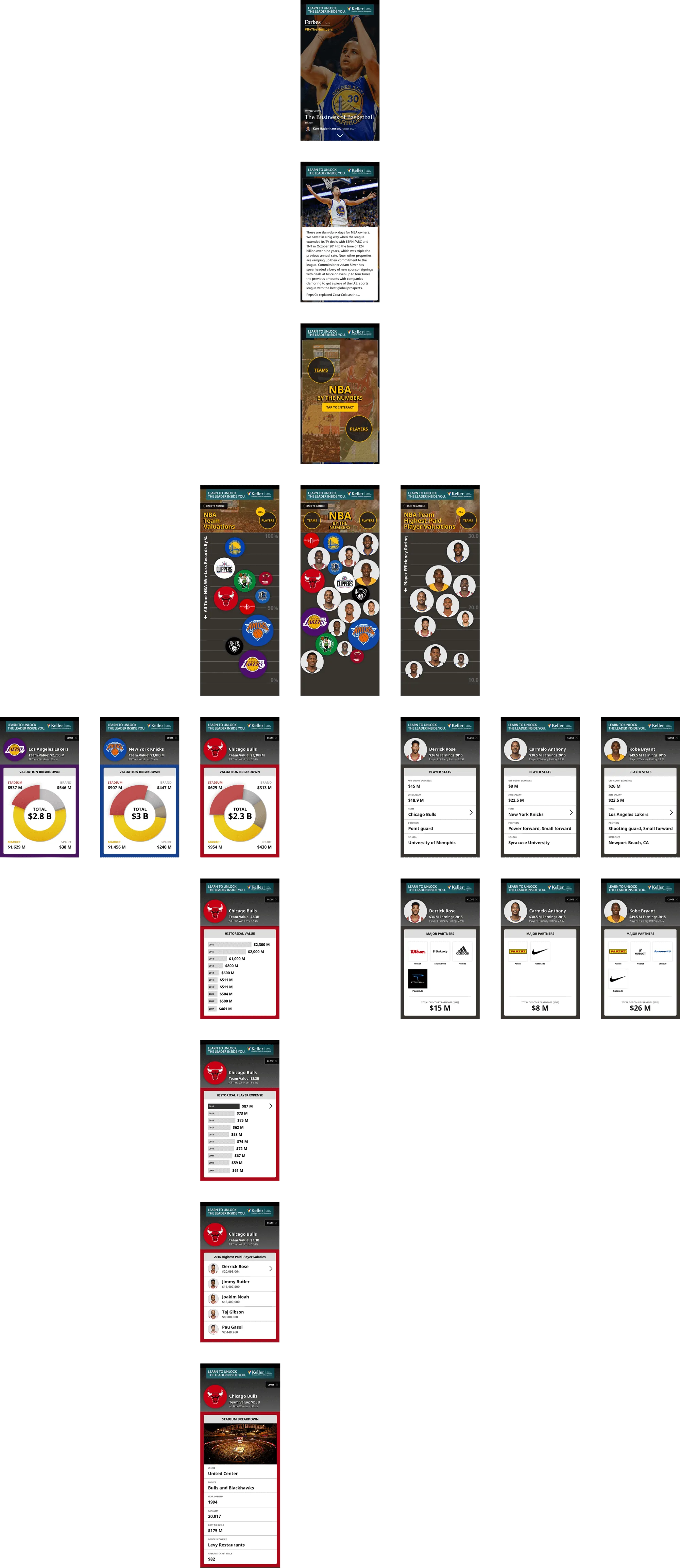
After settling on the wireframes and user flow, I translated the designs into mid-fidelity mockups and imported them into InVision. This allowed me to quickly prototype the experience and share with stakeholders for rapid feedback as a proof of concept.

Implementation and Testing
Once the proof of concept was approved, we beta-launched the product with an upcoming list. Releasing it to a small audience allowed us to test performance and engagement against the existing mobile list template. Based on the desktop package theme, mocks were created and spec’ed out for developers.
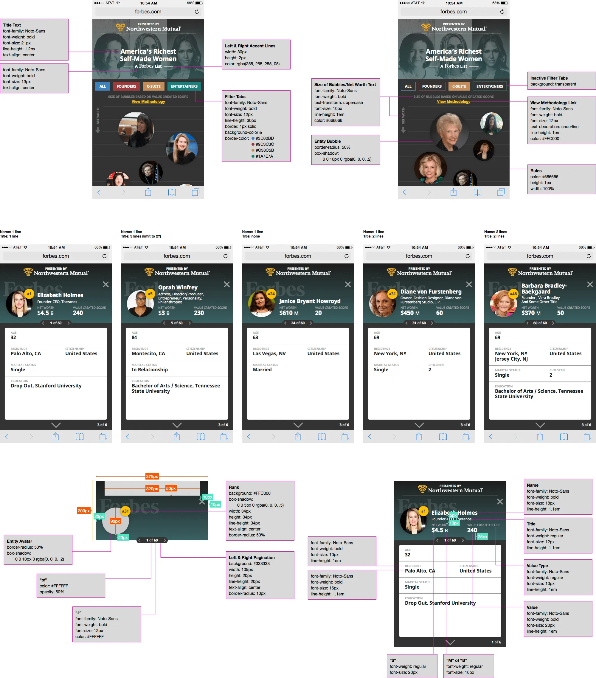
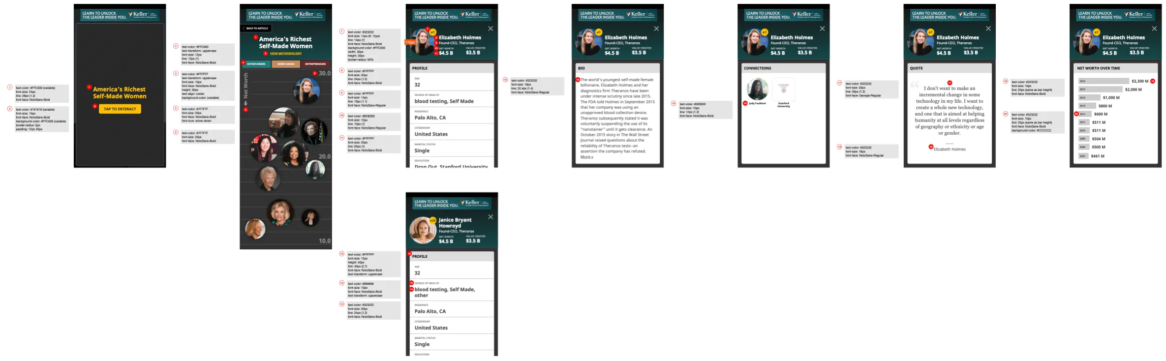
With the designs spec'ed out, I worked closely with developers to finesse transitions and to make sure features were implemented correctly.
Adding New Features
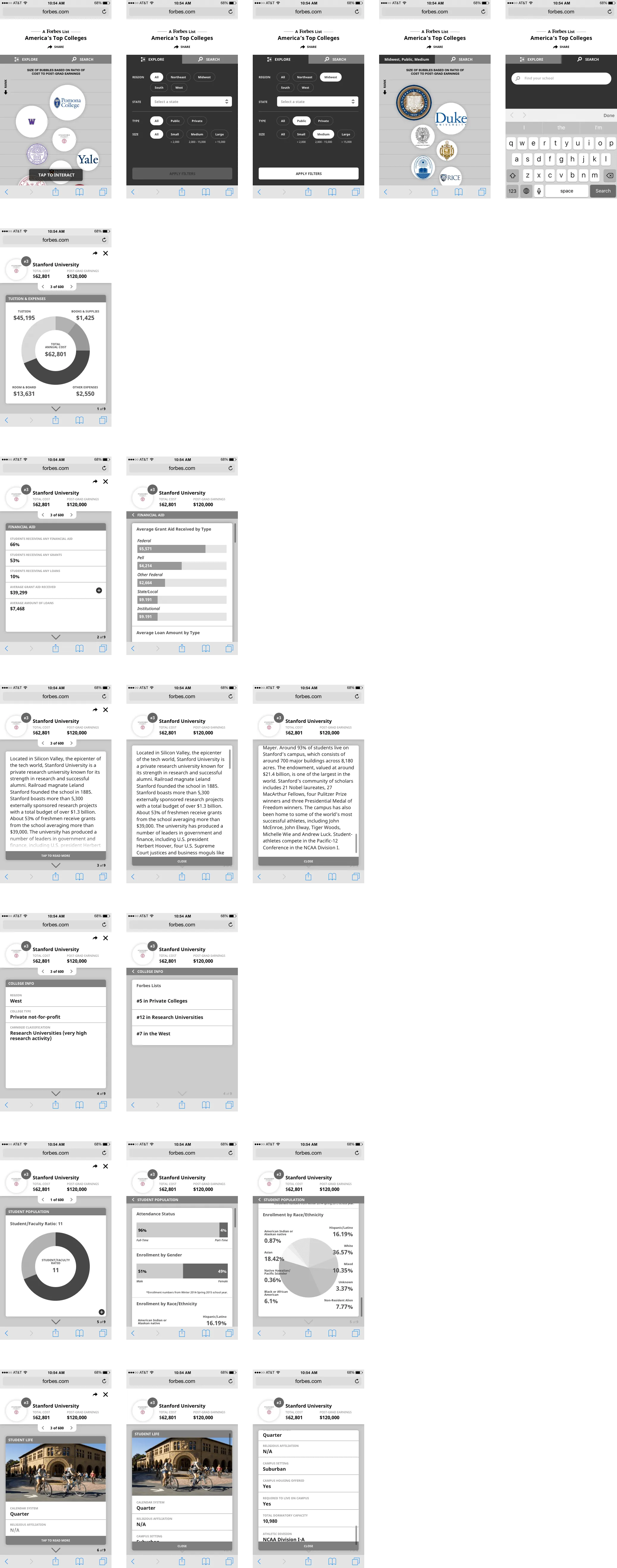
When it came time to launch America’s Top Colleges in this format we discovered new features and content types that we wanted to support to enhance and improve the experience. With the foundation already set, developers had more time to spend on our wishlist items and must-haves for the launch (e.g. more filtering options, search typeahead, expandable cards). I drafted up new wires to help communicate how new features should function.
Collaboration and Handoff
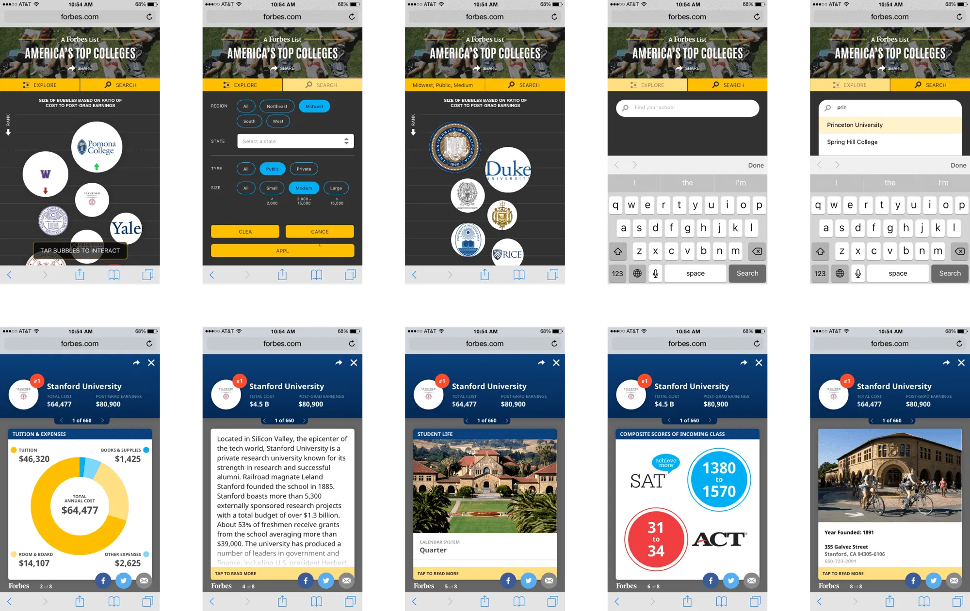
Having created a library of components during the design phase, it was easy to hand off this mobile infographic template to fellow designers who could assist with the color theme and graphics. For this list, I collaborated with a UI designer to align the look and feel with the desktop feature and prepare assets for the developer handoff.
Polishing Up The Design


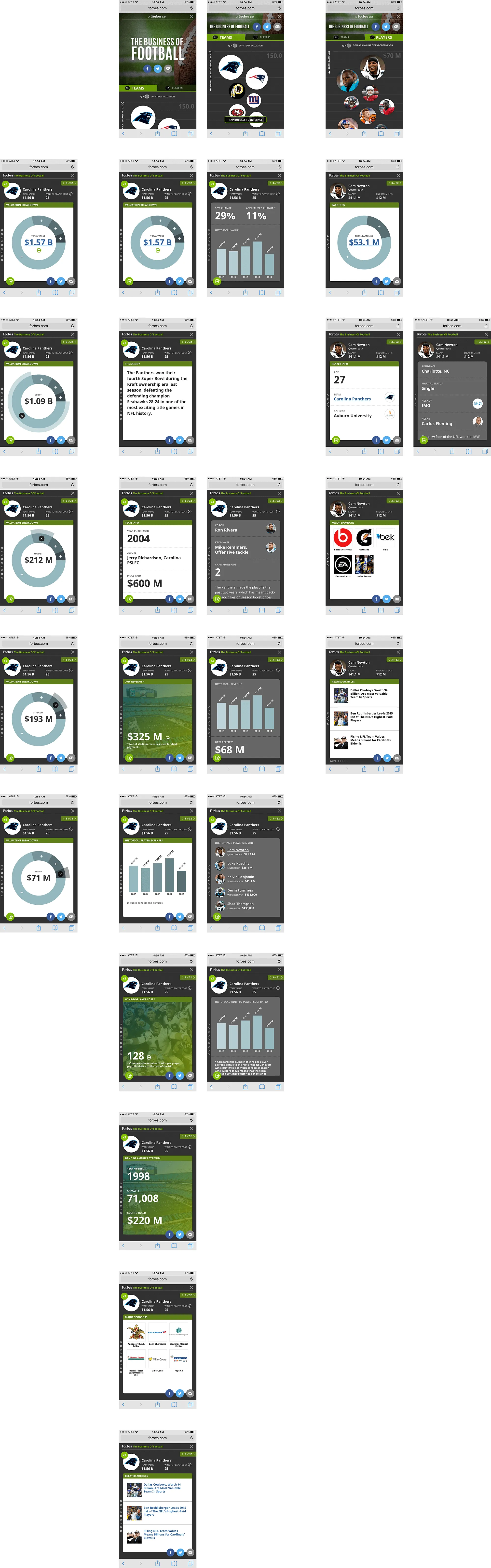
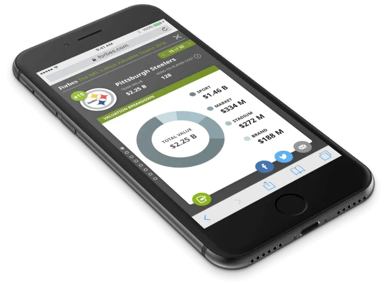

For the NFL Valuations list launch, with no UI designers available, I provided designs and specs for developers, taking the opportunity to polish up the UI. This version was closer to the original proof of concept, interconnecting two separate lists: teams and players. We also explored new interactive elements, such as a pie graph where users could tap on each portion for more information.
Monetization
As the product gained traction, it found a sponsor. With new ad requirements prominently affixing ads to the top of every screen, I adjusted the layout by removing info from the top of cards and introducing new mini intro cover cards.
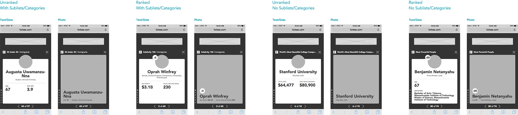
Going from the intro card to the next, we wanted to make sure the current entity can be identified at all times especially since users can land on any card through deep-linking.
Result
The Mobile Infographic experience resulted in a 6x increase in engagement and session lengths that doubled for users who interacted with the Mobile Infographic compared to those who interacted with the mobile list. Since its initial launch, multiple Forbes Lists have been released using this format. See the Forbes Centennial special package, featuring the 100 Greatest Business Minds as a Mobile Infographic.