Mobile PWA
ForbesEvolving Forbes' mobile experience with PWA, featuring a Snapchat-like experience with faster load times and gesture navigation.
- Platform
- Mobile Web App
- Team
-
- UX Designer (me)
- 2 Product Managers
- 1 Lead Developer
- Status
- Retired
- Overview
-
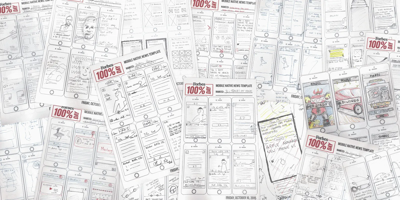
On Friday, October 16, 2015, Forbes held a 100% Mobile Day to gather ideas from everyone in the company on what they envisioned the next mobile native news template would be like. A year and a half later (March 7, 2017) a brand new mobile site is launched to Forbes’ almost 50 million monthly mobile unique visitors.
- My Role
-
As sole UX Designer, I was responsible for conceptual designs, user flows, micro-interactions, rapid prototyping and overseeing the user experience throughout the entirety of the project.
- Read more about it
-
- Forbes Launches All-New Mobile Web Experience for Forbes.com Forbes Press Release
- Inside Forbes: A Rallying Cry For Our Times -- 'Go Mobile Or Go Home' by Lewis DVorkin

Conceptual Designs
Once all the ideas were pared down to a select handful, I was tasked with putting together some visuals along with interactive prototypes for each concept. I took the sketches and quickly put together some high-fidelity prototypes in Invision .


Iterate, Iterate, Iterate
Working closely with the Head of Product, I iterated on the designs and we continuously tested the prototypes before settling on a direction as our proof of concept. Here I explored layouts with varying media making sure I covered all the content types. Wanting to inject some of our Forbes Video content, I created gifs to use as background images throughout the experience.

Back to Basics
Taking a moment to step back, I felt that it was important to map out the user flow and define all the gestures & card types before investing more time on high-fidelity visuals.


Peek-a-Boo
Since this new experience relied on gestures for navigation, we wanted to make sure any new user landing on a PWA article knew how to navigate. I explored various ways to teach users the different gestures using animated prompts; tap to read, swipe left and right to navigate between articles, and up and down to switch topics.


Homepage Concepts
Since PWA articles were designed specifically for mobile, the only way to view them were through direct links (from Google or Facebook), these pages did not have a proper home. With that in mind, here are some concepts explored for a PWA homepage:
Result
The Forbes PWA saw a 2x increase in average user session length, a 6x completion rate, and 20% more impressions compared to the native app. Load times for the app dropped from 12 seconds to 0.8 seconds.
Initially intended to only be a secondary mobile experience, but because it performed so well, it became their primary mobile site.