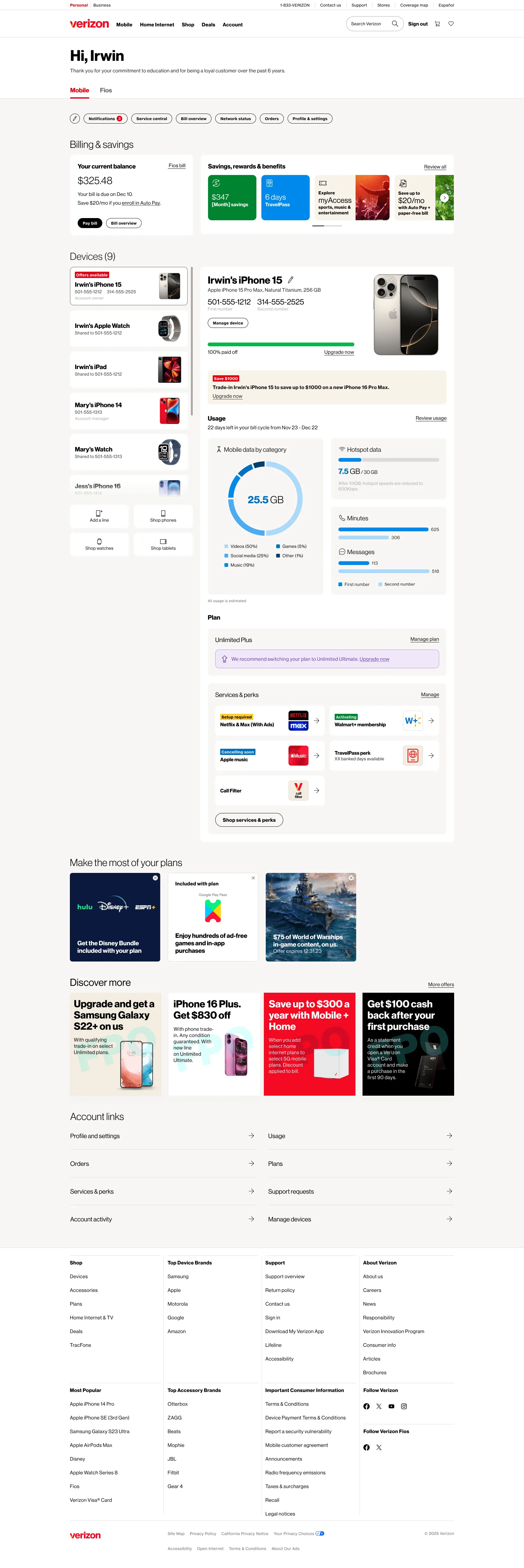
Account Dashboard
Improved Verizon's account dashboard with personalized modules that put key details in view and bring common actions onto the page itself.
- Platform
- Responsive Web App
- Team
- Lead Product Designer
- 2 Experience Designers
- 1 Product Owner
- 1 Product Managers
- 1 Content Strategist
- Dev Team (overseas)
- Status
- Launched(live across roughly 33 million consumer accounts)
- Overview
The account dashboard is the first thing a Verizon customer sees after signing in. It's the central hub for billing, devices, plans, perks, usage, and account actions, and it carries millions of customer interactions.
A dashboard already existed when I joined. Verizon was rolling out a new design system, and we were applying an evolved design language across the account experience, which was an opening to do more than a visual refresh.
- My Role
I worked alongside the Lead Product Designer and another Experience Designer, dividing the page by section. I designed the device and line management area, the account overview modules, and the mobile navigation model.
I was mainly responsible for the responsive layouts across desktop, tablet, and mobile, and for the interactive prototypes used in concept testing, user feedback and stakeholder reviews.
The Problem
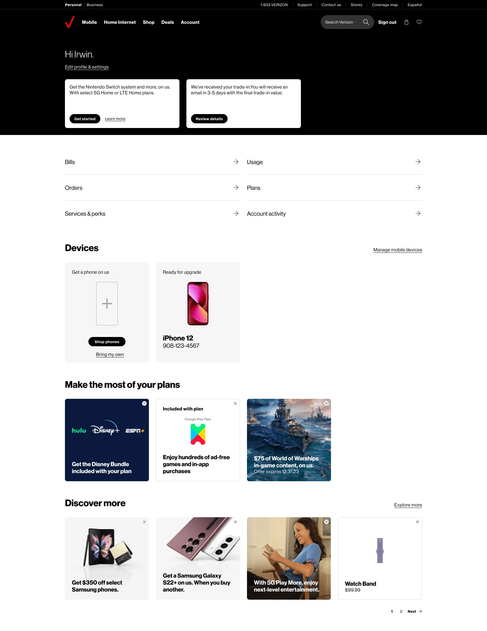
The existing dashboard was built around a simpler account. One person, one device, a bill to check.
Accounts changed. Across Verizon's total retail postpaid base, the average connections per account went from 3.07 at the end of 2016 to 3.55 by early 2024, while the account base held flat at around 35 million. The growth wasn't new customers, it was more devices landing on accounts that already existed. A phone or two became phones, watches, tablets, and other connected devices on one bill, often across people who aren't the account owner.
The existing dashboard had been designed for only a handful of devices. On mobile, the ones further down went unnoticed, and the things people logged in for sat a few screens deep.

Research Findings
The redesign was tested with customers throughout, in moderated sessions run by our research team. An earlier round, run before I joined, had established that customers responded to having everything on one page instead of buried under additional links. That direction was settled by the time I arrived, so my work started from refinement rather than concept.
The round that shaped my sections tested the fuller experience once the modules were built out, and I built the prototypes used as stimuli. That's where the problems below surfaced. Sessions were small-sample, so we treated the output as directional.
The rapid research studies closed loops the larger rounds opened. Customers understood they could add shortcuts but not how to remove or rearrange them, so we tested the edit control on its own, three placements on mobile and two on desktop, alongside the shop tile copy and how much plan detail people wanted to see.

One of the mobile options revealed the control on swipe. It lost to putting the icon on the left, where people were already scanning. Same lesson as the device count. When the problem is discoverability, the plain answer tends to win.
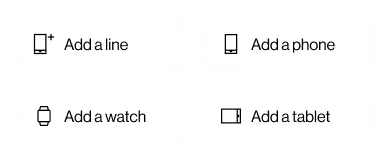
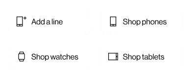
The copy test was the more interesting one. Adding a phone and shopping for a phone are not the same offer on an account like this. When customers are already attaching watches and tablets to their lines, "add" reads as connecting something you own rather than buying something new.
Device Selector
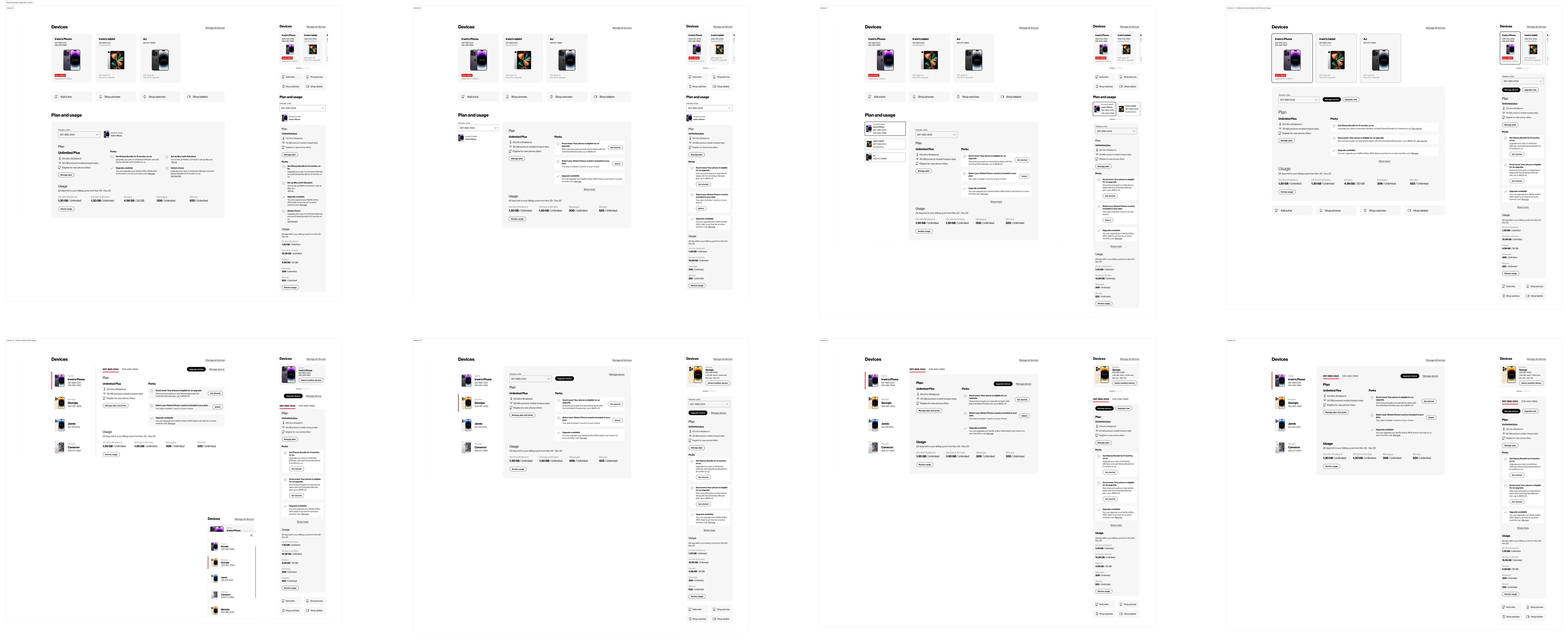
I started to explore ways we could combine the modules and use the devices as selectors on the page to surface the most relevant information to that device.
The existing page already listed devices on the account. Why not use that list to control the rest of the page, so every module reflected the selected device?
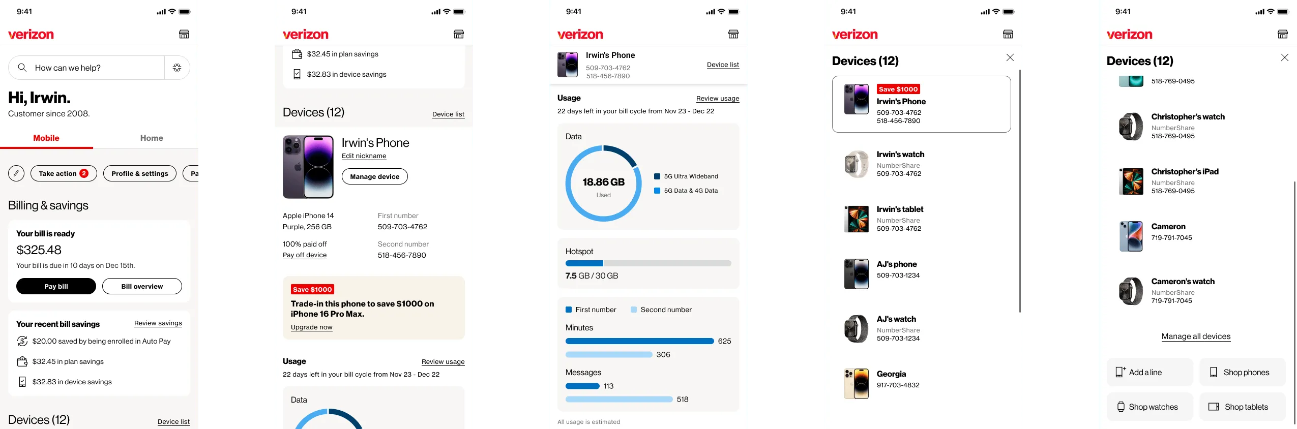
On desktop, customers found the selector and used it correctly. On mobile, devices toward the end of the list would often get lost, and customers had no sense of how many were on the account at all.
Discoverability is about signaling that more exists. Persistence is about not losing access once you've scrolled. They feel like the same problem but they need different solutions.
For discoverability, the fix was the most obvious one. Customers on both platforms independently asked for the same thing, which was they preferred seeing the number of devices next to the label.
For persistence, the selector sticks to the top once you scroll past it and stays within the area it controls. The transition from static to sticky is seamless with the persistent elements transforming between states.
Prime Real Estate
The hardest part of this project wasn't a design problem, it was an allocation problem. Placement on this page is valuable and heavily spoken for. This is a tool for managing an account, not a page that sells to you, so anything too expressive read as marketing.
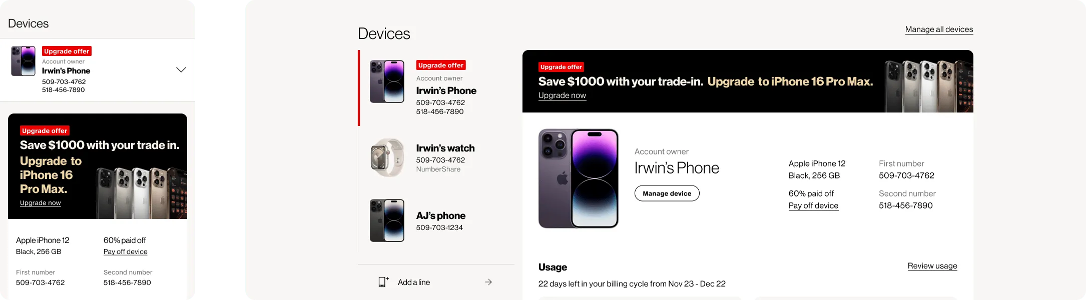
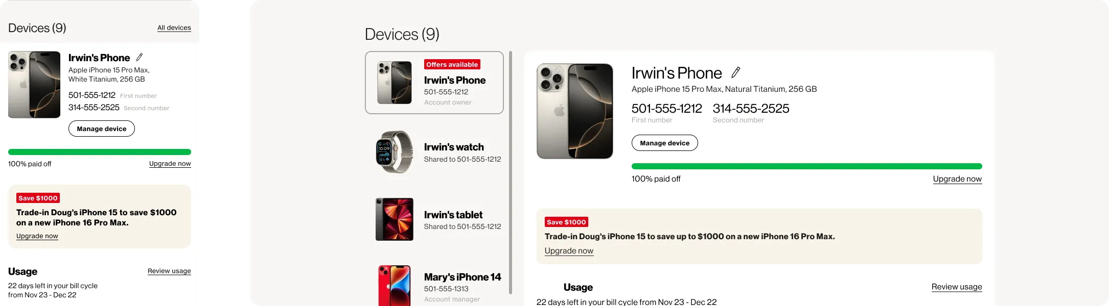
Research settled it. The personalized upgrade offer was still relevant when tied to a specific device, but because it looked like an ad, some customers skipped past it to reach the device details underneath. That reframed the constraint: the risk isn't that people dislike promotional content in prime space, it's that they stop seeing it. Restraint became the thing that made those modules work.
That gave us an argument that worked on both sides of the table. The offer now inherits the same card structure, type scale, and spacing as the modules around it, carries no promotional color field, and leads with the device rather than the offer. Prime real estate is only prime as long as people believe what's in it.
Results
The redesigned dashboard launched in August 2025 and is live to roughly 33 million consumer accounts.